General Informations - top
First of all, we want to say thank you! We are very grateful that you have chosen our template for your website. We will do everything we can to provide you the best support possible. Feel free asking us if you need more help.
Video Tutorials - top
Below is a list of our videos, there were not recorded specifically for this theme but they are universal and you can learn from them the basic theme usage.
- 01 Universal Video - Theme Installation
- 02 Universal Video - Required Plugins Installation
- 03 Universal Video - Menu Setup & Homepage
- 04 Universal Video - Basic Theme Settings
- 05 Universal Video - Sidebar Settings, Creating Unique Sidebars & Widgets
- 06 Universal Video - Twitter Widget Setup
- 07 Universal Video - Blog & Posts
- 08 Universal Video - Portfolio
- 09 Universal Video - Creating Gallery Page
- Visual Composer
Folder Structure - top
Blaszok Theme Folder Structure:
- changelog.txt - this file contains all of the changes from the initial release.
- blaszok.zip - contains all the files required for the theme to run & install (also the main CSS file called 'style.css'), this theme is build on top of MPC WP Boilerplate 2.0
- documentation - this folder contains the help files (which you are currently reading),
- import - this folder contains the xml file with preview theme content.
- psd.zip - this package contains theme mockups in PSD format.
FAQ - top
How to force content to display on the right side in portfolio single item view?
- changelog.txt - this file contains all of the changes from the initial release.
- blaszok.zip - contains all the files required for the theme to run & install (also the main CSS file called 'style.css'), this theme is build on top of MPC WP Boilerplate 2.0
- documentation - this folder contains the help files (which you are currently reading),
- import - this folder contains the xml file with preview theme content.
- psd.zip - this package contains theme mockups in PSD format.
FAQ - top
How to force content to display on the right side in portfolio single item view?When you create a portfolio item make sure that all the content you want to display on the right side (next to the featured images) is embeded inside the first row of the Visual Composer. Everything bellow the first row will be displayed after the featured image.
How to make a "Your Page" to display as Home page?Go to settings>reading inside WordPress admin panel and set static front page as "Your Page".
How to display only the excerpt of the post?Hi, to display only the excerpt of the post you need use the tag in HTML post editor or in visual editor use this button (see) to mark which section of the post you want to show.
How to setup twitter widget.There is a video tutorial coresponding to this section of the documentation - Universal - Twitter Widget Setup
Blurry product images.If you are encountering blurry images on your shop (or shortcodes releated to your products) make sure you have proper image settings in WooCommerce>Products tab. The settings should look like on the image bellow.
 Demo install stops at ... and doesn't go further.
If your demo installation stops in some moment and does not want to go further, then it is probably due low PHP memory limit on yor server or allowed for Wordpress in wp-config.php file. You can check it from Dashboard->WooCommece->System status. If you want to use WooCommerce we strongly recommend to set this value to 128MB. Add this line in the top section of wp-config.php file :
define('WP_MEMORY_LIMIT', '128M');
I can't find Demo Install in my Wordpress Dashboard panel.
Please make sure that you have installed and activated MPC Importer plugin. After that check Theme options->General->Domo Wizard - "Disable Demo Wizard" need to be turned OFF.
Where I can find license key for Visual Composer? I can't update plugin without it.To update Visual Composer you will need to delete it from Wordpress Dashboard and install again from Appearance->Install Plugins(it will be downloaded from our servers). Please notice that you cannot update Visual Composer from author servers because you did not purchased a personal license for this plugin. Visual Composer is bundled with Blaszok with license for themes/plugins (Extended License). You can use it for free only with Blaszok license and all support/updates are provided by us.
I have got double Wishlist button on single product page.Go to YIT Plugins->Wishlist->General Settings->Position set this option to "Use shortcode".
Change Log - top
Blaszok - Ultimate Multi-Purpose Responsive Theme
----------------------------------------------------
14/04/2016 - Version 3.8
- IMPROVED: Wordpress 4.5 support
- IMPROVED: WooCommerce 2.5.5 support
- IMPROVED: Visual Composer 4.11.2 support
- IMPROVED: Revolution Slider 5.2.4.1 support
- FIXED: Lookbook Badges display
- FIXED: Hide Add to Cart issue
- FIXED: Image Gallery with External images
- FIXED: Issue with WooCommerce Subscriptions address
- FIXED: Compability with Contact Form 7 (select)
- FIXED: Compability with Variation Swatches and Photos
- FIXED: Rev Slider on mobile
- FIXED: VC row stretch issue at some cases
- FIXED: Sold Out translation
- FIXED: Breadcrumbs translations
- FIXED: Products Slider CSS issue
- FIXED: Missing Newell home page export
- FIXED: Other small CSS and JS issues

!!! PLEASE NOTICE:
- make sure to update all bundled plugins
- make sure to update/install Visual Composer from our server (we made additional adjustments for WooCommerce conflict)
- make sure to update/install Subscribe2 (we made adjustments for WP 4.5)

----------------------------------------------------

17/01/2016 - Version 3.7
- IMPROVED: Wordpress 4.4.2
- IMPROVED: Visual Compose 4.9.2
- IMPROVED: WooCommerce 2.4.13
- IMPROVED: WooCommerce Quickview 3.2.3
- IMPROVED: Revolution Slider: 5.1.6
- IMPROVED: Ninja Forms compatibility
- IMPROVED: jQuery MegaMenu refactored into MPC - MegaMenu
- ADDED: Featured products for Products slider
- ADDED: Separated Logo settings for each page
- FIXED: Child theme styles priority
- FIXED: Transparent Header with Sticky option at mobile
- FIXED: Sold Out badge display
- FIXED: Read More button hover color
- FIXED: Missing twitter status in post
- FIXED: Wishlist for non-logged users
- FIXED: Wishlist Mobile display
- FIXED: Products slider display glitch
- FIXED: Breadcrumbs
- FIXED: Missing font family for headers in few shortcodes
- FIXED: Small CSS fixes

Due to the lack of updates for jQuery MegaMenu we refactored it into MPC - MegaMenu for future updates and usage. All menus and MegaMenus created with jQuery MegaMenu will work fine with MPC - Mega Menu plugin.

----------------------------------------------------

31/08/2015 - Version 3.6
- IMPROVED: Wordpress 4.3
- IMPROVED: WooCommerce 2.4.6
- IMPROVED: Visual Composer 4.7
- IMPROVED: Revolution Slider 5.0
- IMPROVED: WooCommerce Quickview 3.2.0
- UPDATED: MPC Widgets, jQuery MegaMenu Widget, Brankic Photostream Widget updated for Wordpress 4.3 changes
- ADDED: Breadcrumbs on/off switch
- FIXED: Hide Title at Maintenance Page
- FIXED: Visual Composer issue when Revolution Slider was disabled
- FIXED: WooCommerce Product Tabs accordion display
- FIXED: MiniCart product remove in WC 2.4.6
- FIXED: Visual Composer default settings
- FIXED: Other small CSS fixes

----------------------------------------------------

13/08/2015 - Version 3.5.1
- IMPROVED: WooCommerce 2.4.3 Support
- FIXED: Variation issues with WooCommerce 2.4.x

----------------------------------------------------

03/08/2015 - Version 3.5
- IMPROVED: Wordpress 4.2.3 Support
- IMPROVED: WooCommerce 2.4 Support
- IMPROVED: Visual Composer 4.6.2 Support
- ADDED: Breadcrumbs for Post/Page at title section
- ADDED: Products selection for Products Slider
- ADDED: Columns selection for Products Slider
- ADDED: Products styles (Default, Slim, Center) support for WooCommerce Product/Products shortcodes
- ADDED: New Menu location in Copyright section
- FIXED: Visual Composer update issues
- FIXED: Mini Cart - SSL issues in View Cart and item removing
- FIXED: VC Frontend editor and ACF options reset issue
- FIXED: Font Size issues at Theme Options->Styles->Content for pages
- FIXED: Parallax issue with Essential Grid at Chrome
- FIXED: Better support for Custom WooCommerce taxonomies
- Other small fixes and improvements

----------------------------------------------------
20/07/2015 - Version 3.4.2
- IMPROVED: Visual Composer 4.6.1 support
- IMPROVED: WooCommerce 2.4 preliminary support
- IMPROVED: Documentation
- FIXED: Call to Action css fix
- FIXED: Maintenance Mode fullwidth fix
- FIXED: Other small CSS fixes

----------------------------------------------------

06/07/2015 - Version 3.4.1
- IMPROVED: Visual Composer 4.6
- IMPROVED: MPC Importer is available for update from our servers
- FIXED: Page/Post Content margins for Wordpress Editor content

----------------------------------------------------

23/06/2015 - Version 3.4
- IMPROVED: Demo Installer is a separate plugin now
- ADDED: Automatic Related Products
- ADDED: Header Widget Area image background option
- ADDED: Background Size option for Header, Footer and Extended Footer sections
- FIXED: Wishlist Icon issue
- FIXED: Gravity Forms & CustomSelect conflict

----------------------------------------------------

13/02/2015 - Version 3.1.1
- NEW FEATURE: Author Box for single post view
- IMPROVED: Visual Composer 4.4.2
- IMPROVED: WooCommerce 2.3.3 Support
- IMPROVED: Yith Wishlist 2.0.0 Support
- IMPROVED: WPML Currency Switcher display
- IMPROVED: Products Slider - hide Out Of Stock items
- FIXED: WooCommerce Quickview issues
- FIXED: Missing Font Color for Visual Composer 4.4+

----------------------------------------------------

26/01/2015 - Version 3.1
- NEW FEATURE: New previews Newell and Manufactory
- NEW FEATURE: Maintenance Mode
- NEW FEATURE: New Blog layout "Full width with Thumbnails alternative"
- NEW FEATURE: Categories selection for Blog
- NEW FEATURE: 'Use as banner' option for Post type 'Link'
- NEW FEATURE: Site layout for individual pages/posts/products and portfolio items
- NEW FEATURE: VC shortcode: Countdown
- NEW FEATURE: VC shortcode: Newsletter Box
- NEW FEATURE: VC shortcode: Link Wrapper
- NEW FEATURE: Sticky Header Offset
- NEW FEATURE: Support for WooCommerce 2.3
- UPDATED: Visual Composer 4.4
- UPDATED: Essential Grid 2.0.4
- FIXED: Theme Options slider indicator
- FIXED: Quickview issues
- FIXED: Update Cart for items quantity
- FIXED: Shipping Dropdown styling
- FIXED: Products Hover disable at Products Slider shortcode
- FIXED: Add to Wishlist icon duplication with Load More
- FIXED: Logo image responsive
- FIXED: IE bug for Boxed layout

----------------------------------------------------

10/12/2014 - Version 3.0
- NEW FEATURE: Essential Grid
- NEW FEATURE: Full page width row
- NEW FEATURE: Header widget area
- NEW FEATURE: Grid shortcode options
- NEW FEATURE: Image slider shortcode options
- NEW FEATURE: Header vertical center
- NEW FEATURE: Secondary Header & Copyright padding options
- NEW FEATURE: Customizable text for mini cart button ('Subtotal')
- NEW FEATURE: Deco Heading alignment
- NEW FEATURE: Buttons Border disabler
- NEW FEATURE: Headings Underline settings for Content, Footer, Extended Footer and Sidebar Sections
- UPDATED: Revolution Slider 4.6.5
- UPDATED: One Click Demo installer (Real Preview)
- UPDATED: MPC Extensions
- UPDATED: MPC Widgets
- UPDATED: Translation files
- FIXED: Smart search filters
- FIXED: Large cart popup
- FIXED: Testimonials slider
- FIXED: Sticky Header scroll
- FIXED: Parallax image
- FIXED: Custom header colors
- FIXED: Counter shortcode display
- FIXED: Icon shortcode display

----------------------------------------------------

27/10/2014 - Version 2.0.6
- NEW FEATURE: Added compatibility with Ajax Layered Navigation plugin
- UPDATED: Revolution Slider 4.6.3
- UPDATED: LayerSlider 5.3.2
- FIXED: Registration in WooCommerce 2.2.7
- FIXED: Sidebar display in RTL
- FIXED: Portfolio tags archive
- FIXED: Single portfolio post display

----------------------------------------------------

25/09/2014 - Version 2.0.5
- FIXED: Posts Grid/Carousel shortcode
- FIXED: Transparent header on Shop
- FIXED: Shop columns display
- FIXED: Small CSS improvements

----------------------------------------------------

19/09/2014 - Version 2.0.4
- NEW FEATURE: Open social links in new tabs
- UPDATED: LayerSlider 5.3.0
- IMPROVED: WooCommerce 2.2.4 support
- FIXED: Products Slider styles
- FIXED: Transparent header
- FIXED: Small CSS improvements

----------------------------------------------------

11/09/2014 - Version 2.0.3
- UPDATED: Visual Composer 4.3.4
- IMPROVED: WooCommerce 2.2 support
- FIXED: Small CSS improvements

----------------------------------------------------

04/09/2014 - Version 2.0.2
- NEW FEATURE: Disable Demo Install page
- UPDATED: Revolution Slider 4.6.0
- IMPROVED: WordPress 4.0 Compatibility
- FIXED: Visual Composer carousel
- FIXED: Large cart popup
- FIXED: Small CSS improvements

----------------------------------------------------

22/08/2014 - Version 2.0.1
- UPDATED: Visual Composer 4.3.3
- FIXED: Text Block issue on some pages

----------------------------------------------------

18/08/2014 - Version 2.0
- NEW FEATURE: Grid creator and shortcode
- NEW FEATURE: Masonry Blog with Load More
- NEW FEATURE: Portfolio Load More
- NEW FEATURE: MailChimp support
- NEW FEATURE: Shop styles for products slider
- UPDATED: Visual Composer 4.3.2
- UPDATED: LayerSlider 5.2.0
- UPDATED: Documentation
- UPDATED: Localization files
- IMPROVED: Demo Installer content
- FIXED: Small CSS improvements
- FIXED: Main color issues with skins

----------------------------------------------------

31/07/2014 - Version 1.8.0
- NEW FEATURE: RTL Support
- NEW FEATURE: Configurable post thumbnail
- NEW FEATURE: Brands slider external links
- UPDATED: Visual Composer 4.3
- UPDATED: LayerSlider 5.1.2
- UPDATED: MPC plugins
- UPDATED: Documentation
- UPDATED: Localization files
- IMPROVED: Demo Installer content
- FIXED: Menu active/hover color
- FIXED: Large cart popup

----------------------------------------------------

22/07/2014 - Version 1.7.0
- NEW FEATURE: Demo Installer
- UPDATED: Revolution Slider 4.5.9
- UPDATED: Documentation
- FIXED: Small CSS improvements to the shop

----------------------------------------------------

03/07/2014 - Version 1.6.1
- IMPROVED: Performance
- IMPROVED: Mobile experience and display
- IMPROVED: Child theme styles
- IMPROVED: Compatibility with W3 Total Cache and Better Wordpress Minify
- UPDATED: Revolution Slider 4.5.6
- UPDATED: WooCommerce Quickview 3.0.6
- UPDATED: Documentation (with performance tips - up to 40% improvement)

----------------------------------------------------

18/06/2014 - Version 1.6.0
- NEW FEATURE: Scroll to #ID
- NEW FEATURE: Sliders light arrows
- NEW FEATURE: Simple icon columns
- NEW FEATURE: Sticky header logo
- NEW FEATURE: Separators width and alignment
- NEW FEATURE: Icon shortcode
- NEW FEATURE: Counter shortcode
- UPDATED: Visual Composer 4.2.3
- UPDATED: Revolution Slider 4.5.4
- UPDATED: MPC plugins
- UPDATED: Documentation
- UPDATED: Localization files
- FIXED: Revolution Slider responsiveness
- FIXED: Pricing Tables display
- FIXED: Flexslider arrows
- FIXED: Back to top animation
- FIXED: Gravity Forms display
- FIXED: bbPress display

----------------------------------------------------

12/06/2014 - Version 1.5.1
- FIXED: Update process of Visual Composer
- FIXED: Added plugins files for manual install
- FIXED: Some other small issues from 1.5.0 update

----------------------------------------------------

11/06/2014 - Version 1.5.0
- NEW FEATURE: Shop custom columns number
- NEW FEATURE: Product accordion details
- NEW FEATURE: bbPress support
- NEW FEATURE: Panel settings import/export
- IMPROVED: Price filter on mobile
- IMPROVED: Grafvity Forms support
- UPDATED: Visual Composer 4.2.2
- UPDATED: Revolution Slider 4.5.2
- FIXED: Revolution Slider display issue
- FIXED: Sidebar display on mobile
- FIXED: Sidebar behavior on mobile
- FIXED: Menu active custom color
- FIXED: Socials link redirect
- FIXED: Coupon field display in cart

----------------------------------------------------

27/05/2014 - Version 1.4.0
- NEW FEATURE: Transparent header (with custom colors, opacity and layout)
- NEW FEATURE: Separate font sizes for page sections (header, sidebar, etc.)
- NEW FEATURE: Advance color settings for page sections (header, sidebar, etc.)
- NEW FEATURE: New mobile menu (icon in header with dropdown)
- NEW FEATURE: Simple search dropdown
- NEW FEATURE: Mobile logo
- NEW FEATURE: Custom labels for WooCommerce tabs
- NEW FEATURE: Custom font for menu
- NEW FEATURE: Mobile sticky header
- NEW FEATURE: Hidding footer segments for each page
- NEW FEATURE: Header full width display
- IMPROVED: Custom CSS are now saved to separate file
- IMPROVED: Bundled plugins update process
- IMPROVED: Moved plugins from theme file
- IMPROVED: All pages heading changed to H1
- IMPROVED: Header buttons display as icons
- IMPROVED: New social icons
- UPDATED: MPC plugins
- UPDATED: Visual Composer 4.1.3.1
- UPDATED: CSS3 Pricing Tables 9.6
- UPDATED: WooCommerce Quickview 3.0.5
- UPDATED: FontAwesome 4.1
- FIXED: Shop category permalink issue

----------------------------------------------------

14/05/2014 - Version 1.3.1
- IMPROVED: Products slider (Sale products slider, sale badge)
- IMPROVED: Woocommerce Sold Out Products support
- UPDATED: MPC plugins
- UPDATED: Documentation
- UPDATED: Localization files
- UPDATED: Visual Composer 4.1.3
- FIXED: Quickview icon display
- FIXED: Cart/Checkout order display

----------------------------------------------------

10/05/2014 - Version 1.3.0
- NEW FEATURE: Quickview for products
- NEW FEATURE: Shop categories/tags custom header image/shortcode
- NEW FEATURE: Shop categories/tags custom sidebar settings
- NEW FEATURE: Global disable hover effect on products
- IMPROVED: Checkout display
- IMPROVED: Fancy Product Designer support
- IMPROVED: Woocommerce Smart Coupons support
- UPDATED: MPC plugins
- UPDATED: Woocommerce templates
- FIXED: Fullwidth with sidebar template on Shop
- FIXED: Products slider on desktop

----------------------------------------------------

30/04/2014 - Version 1.2.3
- IMPROVED: External products display
- UPDATED: New versions of MPC plugins with update notifications
- UPDATED: Localization files
- UPDATED: Slider Revolution 4.3.8
- FIXED: Wishlist and checkout alignment in boxed layout
- FIXED: Mobile cart duplication
- FIXED: Updating cart saves products quantities
- FIXED: Child theme translation

----------------------------------------------------

25/04/2014 - Version 1.2.2
- FIXED: Wishlist display
- FIXED: Page title duplication
- FIXED: Mobile logo display

----------------------------------------------------

23/04/2014 - Version 1.2.1
- UPDATED: Visual Composer 4.1.2
- FIXED: Cart issues
- FIXED: My account issues
- FIXED: Google Maps
- FIXED: Currency symbol space
- FIXED: Sliders touch
- FIXED: Mobile logo
- FIXED: Sliders mobile display
- FIXED: Parallax
- FIXED: MPC Shortcodes button
- FIXED: Fullwidth with sidebar template
- FIXED: Background settings
- FIXED: Visual Composer shortcodes

----------------------------------------------------

18/04/2014 - Version 1.2.0
- NEW FEATURE: All sliders are now touch enabled
- NEW FEATURE: Testimonials Visual Composer Shortcode
- NEW FEATURE: Added two new product looks
- NEW FEATURE: Custom Product tabs with WYSIWYG editor & short code support
- NEW FEATURE: Size Guides: global or unique for a product
- NEW FEATURE: Styled WooCommerce Subcategory Shop View
- NEW FEATURE: Disable Responsive
- NEW FEATURE: Turn Off Search Checkbox
- NEW FEATURE: Secondary Header + Secondary Menu With Drop Down
- NEW FEATURE: Turn Off Subscription
- NEW FEATURE: Full Width Page + Sidebar
- NEW FEATURE: Add text instead of subscription
- NEW FEATURE: Pinterest added to share
- NEW FEATURE: Back to Top: left, right, center & none settings.
- NEW FEATURE: Added option - Don’t change product photo on hover.
- IMPROVED: Cart - mobile friendly
- IMPROVED: Wishlist, added button + tooltip
- IMPROVED: Account View
- IMPROVED: Search - Close search when clicked outside
- IMPROVED: Icon List Shortcode
- IMPROVED: Products number display option
- IMPROVED: Documentation - completely new design
- UPDATED: WordPress 3.9 Copatbility
- UPDATED: Responsiveness
- UPDATED: Visual Composer 4.1
- UPDATED: Slider Revolution 4.3.6
- FIXED: VAT Bug
- FIXED: Mega Menu Bug
- FIXED: FireFox Load More Bug
- FIXED: Related Products Bug
- FIXED: Currency in Search Field
- FIXED: Skin issues

----------------------------------------------------

08/04/2014 - Version 1.1.1
- NEW FEATURE: Compact Archive View (small thumbnails)
- ADDED: New Header Layout (Logo above, menu & cart centered)
- ADDED: Mobile Footer Check Box
- UPDATED: Visual Composer to 4.0.4
- UPDATED: Slider Revolution 4.3.4
- FIXED: Contact Form Issue
- FIXED: Carousel Bug (Not responsive)

----------------------------------------------------

03/04/2014 - Version 1.1.0
- NEW FEATURE: Layer Slider 5 (worth $18)
- NEW FEATURE: CSS3 Pricing Tables (worth $17)
- NEW FEATURE: Masonry Shop
- NEW FEATURE: Load More for masonry shop
- ADDED: Home pages source in txt files
- UPDATED: Documentation
- UPDATED: Menu layouts, new style Menu, Cart, Logo
- FIXED: Mobile cart expanding viewport
- FIXED: Visual Composer teaser group responsive
- FIXED: Carousel Bug (Not responsive)
- FIXED: iOS bugs
- FIXED: Adroid bugs
- FIXED: Minor CSS fixes

----------------------------------------------------

28/03/2014 - Version 1.0.4
- NEW FEATURE: Envato toolkit, Easy update
- UPDATED: Documentation
- FIXED: Required plugins install error
- FIXED: WooCommerce single product image

----------------------------------------------------

27/03/2014 - Version 1.0.3
- NEW FEATURE: Simple Lookbook Price Badges
- NEW FEATURE: Row ID for page navigation
- FIXED: IE Lookbooks
- FIXED: Parallax behavior
- FIXED: Portfolio spacing
- FIXED: Titles underline
- FIXED: Language & Currency drop downs
- FIXED: Quote display

----------------------------------------------------

25/03/2014 - Version 1.0.2
- NEW FEATURE: Option to remove Cart
- NEW FEATURE: Option to remove Price
- NEW FEATURE: Option to remove Add To Basket
- NEW FEATURE: Option to choose different menu for mobile divices
- NEW FEATURE: Added Child Theme
- NEW FEATURE: Custom skin.css
- UPDATED: Visual Composer 4.0.3
- UPDATED: Documentation
- UPDATED: PO File
- FIXED: Reviews mobile issue
- FIXED: Menu layout when scrolling
- FIXED: Lookbook price issue
- FIXED: Child theme issues
- FIXED: Some minor CSS issues

----------------------------------------------------

20/03/2014 - Version 1.0.1
- FIXED: "Login" redirects to "My Account"
- FIXED: Cart mobile display
- FIXED: Demo content URLs and Sliders imports
- FIXED: WooCommerce shortcodes styles

----------------------------------------------------

19/03/2014 - Version 1.0
- RELEASE
Sources and Credits - top
I've used the following plugins as listed.Getting Started - top
In this section we will go over the process of setting up WordPress environment, next I will show you how to install and activate your brand new theme. Finally you will learn how to setup all of the key features of Blaszok theme.
Preparing WordPress - top
If you already have WordPress installed on your server just skip to the next section. If you haven't yet installed WordPress on your server here you will find a complete guide on this topic. Just follow the steps and you will be ready in a blink of an eye with your shiny new WordPress website.
Installation and Theme Activation - top
There is a video tutorial corresponding to this section of the documentation - Universal Video - Theme InstallationEach WordPress Theme can be installed in three ways: via ftp client, through the admin panel:
Installing WordPress Theme via FTP client:
- unzip the 'blaszok.zip' package (the zip package is inside the folder you have downloaded from ThemeForest),
- connect to your server,
- navigate to the folder where your WordPress is installed,
- go to wp-content/themes/,
- upload the 'blaszok' folder into the 'themes' directory (the path will look like this: wp-content/themes/blaszok),
- open the wp-admin panel (navigate through web browser to the folder where you have installed the WordPress e.g www.your_domain.com/wp-admin/),
- login to your wp-admin panel then from the sidebar on the left choose 'Appearance',
- under 'Appearance' choose 'Themes',
- find the 'blaszok' theme and click the 'Activate' button next to it.
- open the wp-admin panel (navigate through web browser to the folder where you have installed the WordPress e.g www.your_domain.com/wp-admin/),
- login to your wp-admin panel then from the sidebar on the left choose 'Appearance',
- under 'Appearance' choose 'Themes',
- at the top click 'Install Themes' tab,
- under the header click the 'Upload' link,
- you will be redirected to upload form, click the 'choose file' button and navigate to the unzipped package that you have download from ThemeForest site, inside that package is a file called 'blaszok.zip' choose it and click 'open',
- once the theme is done uploading it will automatically install,
- after the installation you will be able to activate the theme to do this click the "blue" activation link.
Required Plugins - top
There is a video tutorial corresponding to this section of the documentation - Universal Video - Required Plugins InstallationAfter installing and activating the theme you will see a yellow popup at the top of the page. Saying: "This theme requires the following plugins..." please click the 'Begin Installing plugins' link.

 You will be redirected to 'Install Required Plugins' page, here you will find all of the theme required plugins. To install them just check all of them and from the drop down select install once installed do the same to activate them.
- ACF Gallery - gallery addon required for custom meta fields,
- ACF Repeater - special addon required for custom meta fields,
- Advanced Custom Fields - plugin which enables the themes custom meta fields,
- MPC Extensions - package containing all of the MPC extensions,
- MPC Shortcodes - this plugin contains themes shortcodes,
- MPC Widgets - custom widgets for the Blaszok theme,
- Visual Composer - this is the great page builder that comes with this theme,
- Custom Sidebars - this plugin enables an easy way to customize your sidebars and create unique sidebars for each page,
- Contact Form 7 - this is a plugin adds an awesome customizable contact form to the theme,
- Brankic Photostream - this is a plugin which adds Flickr/Pinterest/Dribbble/Instagram widget.
- Get Kudos - if you use a kudos website install this plugin
- Slider Revolution - one of the most advanced slider on the market
- Sibscribe 2 - plugin used for a newsletter functionality
- WooCommerce - ecommerce plugin for wordpress
- WooSidebar - sidebar manager
- SEO by Yoast - improves website seo
- YITH Wishlist - wishlist plugin for your shop
- jQuery Mega Menu - Menu plugin for WordPress
After installing the Visual Composer please go to 'Settings>Visual Composer' and make sure to check the following checkboxes under Content Types: post, page, products & mpc_portfolio. After making the changes please click the 'Save Changes' button.
How to setup your theme to look like in ThemeForest preview by using our Demo Install - top
Since Blaszok update 3.4, we have separeted Demo Installer from main Blaszok theme package. Demo Install is only available from Wordpress admin panel if you install and activate "MPC Importer" plugin.
If you want to setup your theme to look like the Blaszok preview from ThemeForest please follow this guide. The process is very simple and it should take up to 5 minutes.
Before you begin using our easy Demo Installer please install the theme and all required plugins. After you have everything set up you can proceed to Demo Installer.
Please go to Demo Install from your Wordpress dashboard panel. If you see a notify about Permalinks, you need go to Settings->Permalinks and select one of the available permalinks structure instead of default.
- 1. First step of the installation is to choose one of the Blaszok styles.
- 2. After that, you need to choose which part of demo content you want to install. If you do not know what to choose, please select all of them.
- 3. If you choose at least one of the option from the step above, click the 'Begin import of...' to start installation. After a few minutes, your installation will be completed.
How to setup your theme to look like in ThemeForest preview - top
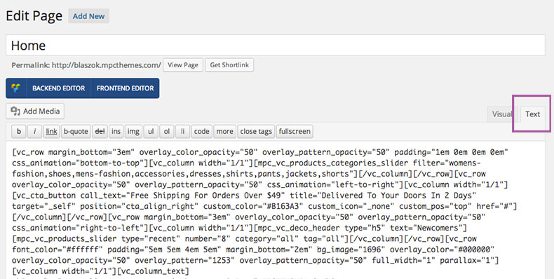
Home ContentWith Blaszok we are also providing the content for the home pages please go to 'import/home-content' folder inside the 'package you have downloaded from ThemeForest' in there you will find few separate *.txt files. Each of them represents the home version you can copy the code from there and paste it inside the text editor of the page (Look at the image bellow). Once you do this you can switch to 'BackEnd Editor' of the Visual Composer to see how the structure looks like.
 How to setup the home versions
Bellow I will explain how to setup your page to look like the different home page versions.
- Home Default:
Theme Options settings:- Fonts > Font Family > Heading Font: Raleway - 600
- Fonts > Font Family > Content Font: Raleway - regular
- Fonts > Font Family > Menu Font: Raleway - 500
- Visual > Display > Skin: Default
- Visual > Display > Theme Layout: Fullwidth
- Visual > Display > Disable Buttons Border Color: ON
- Visual > Background > Type: None
- Visual > Color > Main Color: #965182
- Elements > Header > Main Header Layout: Logo, Menu, Search
- Elements > Header > Enable Vertical Center: ON
- Elements > Secondary Header > Enable Secondary Header: ON
- Elements > Secondary Header > Secondary Header Layout: Newsletter, Socials, Menu
- Elements > Secondary Header > Secondary Header Position: Top
- Elements > Secondary Header > Secondary Header Padding: 0.5em 0 0.5em 0
- Elements > Header Widget Area > Enable Header Widget Area: ON
- Elements > Header Widget Area > Header Widget Area Columns Number: 3
- Styles > Options > Use Advance Colors: ON
- Styles > Options > Use Advance Font Sizes: ON
- Styles > Header > Header Background: #ffffff
- Styles > Header > Header Border: #eeeeee
- Styles > Header > Header Font: #666666
- Styles > Header > Header Active/Hover: #1e8bc3
- Styles > Header > Header Menu: 13px
- Styles > Header > Header Button: 14px
- Styles > Secondary Header > Header Background: #333333
- Styles > Secondary Header > Header Border: #333333
- Styles > Secondary Header > Header Font: #f0f0f0
- Styles > Secondary Header > Header Active/Hover: #1e8bc3
- Styles > Header Widget Area > Header Background: #333333
- Styles > Header Widget Area > Header Border: #333333
- Styles > Header Widget Area > Header Font: #f0f0f0
- Styles > Header Widget Area > Header Active/Hover: #1e8bc3
- Styles > Dropdowns > Dropdown Background: #ffffff
- Styles > Dropdowns > Dropdown Border: #eeeeee
- Styles > Dropdowns > Dropdown Font: #666666
- Styles > Dropdowns > Dropdown Active/Hover: #1e8bc3
- Styles > Search > Search Background: #ffffff
- Styles > Search > Search Border: #eeeeee
- Styles > Search > Search Font: #666666
- Styles > Search > Search Active/Hover: #1e8bc3
- Styles > Sidebar > Sidebar Background: #ffffff
- Styles > Sidebar > Sidebar Border: #eeeeee
- Styles > Sidebar > Sidebar Font: #666666
- Styles > Sidebar > Sidebar Active/Hover: #1e8bc3
- Styles > Sidebar > Sidebar Heading Border: #aaaaaa
- Styles > Sidebar > Sidebar Header: 13px
- Styles > Sidebar > Sidebar Content: 13px
- Styles > Sidebar > Sidebar Small: 12px
- Styles > Content > Content Heading Border: #aaaaaa
- Styles > Content > Content Header: 15px
- Styles > Footer > Footer Background: #333333
- Styles > Footer > Footer Border: #333333
- Styles > Footer > Footer Font: #f0f0f0
- Styles > Footer > Footer Active/Hover: #1e8bc3
- Styles > Footer > Footer Heading Border: #666666
- Styles > Footer > Footer Header: 15px
- Styles > Extended Footer > Extended Footer Background: #ffffff
- Styles > Extended Footer > Extended Footer Border: #eeeeee
- Styles > Extended Footer > Extended Footer Font: #666666
- Styles > Extended Footer > Extended Footer Active/Hover: #1e8bc3
- Styles > Extended Footer > Extended Footer Heading Border: #aaaaaa
- Styles > Copyright > Copyright Background: #333333
- Styles > Copyright > Copyright Border: #333333
- Styles > Copyright > Copyright Font: #f0f0f0
- Styles > Copyright > Copyright Active/Hover: #1e8bc3
- Styles > Copyright > Copyright: 14px
Page settings:- Page Attributes > Template: Fullwidth
- Page Header > Header Content: [rev_slider home_1]
- Page Header > Hide Title: ON
- Discussion > Allow Comments: OFF
- Home Lookbook:
Theme Options settings:- Fonts > Heading Font: Raleway - regular
- Fonts > Menu Font: Raleway - 500
- Visual > Display > Skin: Default
- Visual > Display > Theme Layout: Fullwidth
- Visual > Background > Type: None
- Visual > Color > Main Color: #bb114f
- Elements > Header > Main Header Layout: Logo, Right Menu, Search
- Elements > Secondary Header > Enable Secondary Header: OFF
- Styles > Options > Use Advance Colors: ON
- Styles > Options > Use Advance Font Sizes: ON
- Styles > Header > Header Active/Hover: #bb114f
- Styles > Header > Header Menu: 13px
- Styles > Header > Header Button: 13px
- Styles > Secondary Header > Secondary Header Active/Hover: #bb114f
- Styles > Dropdowns > Dropdowns Active/Hover: #bb114f
- Styles > Search > Search Active/Hover: #bb114f
- Styles > Sidebar > Sidebar Active/Hover: #bb114f
- Styles > Sidebar > Sidebar Active/Hover: #bb114f
- Styles > Footer > Footer Active/Hover: #bb114f
- Styles > Extended Footer > Extended Footer Active/Hover: #bb114f
- Styles > Copyright > Copyright Active/Hover: #bb114f
Page settings:- Page Attributes > Template: Lookbook
- Footer > Hide Extended Footer: ON
- Footer > Hide Footer: ON
- Footer > Hide Copyright: ON
- Page Header > Header Content: [rev_slider lookbook2]
- Page Header > Hide Title: ON
- Page Header > Force Header Fullwidth: ON
- Transparent Header > Enable Transparent Header: ON
- Transparent Header > Enable Force Simple Buttons: ON
- Transparent Header > Vertical Center Elements: OFF
- Transparent Header > Force Font Color: #333333
- Transparent Header > Force Background Color: #ffffff
- Transparent Header > Background Opacity: 0%
- Transparent Header > Force Font Color - Sticky: #666666
- Transparent Header > Force Background Color - Sticky: #ffffff
- Discussion > Allow Comments: OFF
- Home Shop:
Theme Options settings:- Fonts > Heading Font: Raleway - regular
- Fonts > Content Font: Open Sans - regular
- Visual > Display > Skin: Default
- Visual > Display > Theme Layout: Floating Boxed
- Visual > Background > Type: Custom Background
- Visual > Color > Main Color: #aa8a59
- Elements > Header > Main Header Layout: Logo, Center Menu & Search
- Elements > Header > Enable Simple Menu: ON
- Elements > Header > Enable Simple Menu Label: ON
- Elements > Header > Enable Simple Buttons: ON
- Elements > Secondary Header > Enable Secondary Header: OFF
- Styles > Options > Use Advance Colors: ON
- Styles > Options > Use Advance Font Sizes: ON
- Styles > Header > Header Background: #222222
- Styles > Header > Header Border: #222222
- Styles > Header > Header Font: #f0f0f0
- Styles > Header > Header Active/Hover: #aa8a59
- Styles > Header > Header Menu: 14px
- Styles > Header > Header Button: 14px
- Styles > Secondary Header > Secondary Header Active/Hover: #aa8a59
- Styles > Dropdowns > Dropdowns Active/Hover: #aa8a59
- Styles > Search > Search Active/Hover: #aa8a59
- Styles > Sidebar > Sidebar Active/Hover: #aa8a59
- Styles > Sidebar > Sidebar Header: 16px
- Styles > Sidebar > Sidebar Content: 14px
- Styles > Sidebar > Sidebar Small: 13px
- Styles > Content > Content Header: 15px
- Styles > Footer > Footer Background: #202020
- Styles > Footer > Footer Border: #202020
- Styles > Footer > Footer Font: #cccccc
- Styles > Footer > Footer Active/Hover: #aa8a59
- Styles > Footer > Footer Header: 15px
- Styles > Extended Footer > Extended Footer Active/Hover: #aa8a59
- Styles > Copyright > Copyright Background: #222222
- Styles > Copyright > Copyright Border: #222222
- Styles > Copyright > Copyright Font: #f0f0f0
- Styles > Copyright > Copyright Active/Hover: #aa8a59
- Styles > Copyright > Copyright: 14px
Page settings:- Page Attributes > Template: Fullwidth
- Footer > Hide Extended Footer: ON
- Page Header > Header Content: [rev_slider home_3]
- Page Header > Hide Title: ON
- Discussion > Allow Comments: OFF
- Home Grid:
Theme Options settings:- Fonts > Heading Font: PT Sans - regular
- Fonts > Content Font: PT Sans - regular
- Visual > Display > Skin: Default
- Visual > Display > Theme Layout: Fullwidth
- Visual > Display > Large Archive Thumbnails: ON
- Visual > Color > Main Color: #e45555
- Elements > Header > Main Header Layout: Logo, Menu, Search
- Elements > Secondary Header > Enable Secondary Header: ON
- Elements > Secondary Header > Secondary Header Layout: Menu, Newsletter, Social
- Elements > Secondary Header > Secondary Header Position: TOP
- Elements > Secondary Header > Enable Subscribe Form: OFF
- Styles > Options > Use Advance Colors: ON
- Styles > Options > Use Advance Font Sizes: ON
- Styles > Header > Header Active/Hover: #e45555
- Styles > Header > Header Menu: 14px
- Styles > Secondary Header > Secondary Header Background: #212121
- Styles > Secondary Header > Secondary Header Border: #1e1e1e
- Styles > Secondary Header > Secondary Header Font: #ffffff
- Styles > Secondary Header > Secondary Header Active/Hover: #e46363
- Styles > Dropdowns > Dropdowns Active/Hover: #e46363
- Styles > Search > Search Active/Hover: #e46363
- Styles > Sidebar > Sidebar Active/Hover: #e46363
- Styles > Footer > Footer Active/Hover: #e46363
- Styles > Copyright > Copyright Active/Hover: #aa8a59
- Styles > Copyright > Copyright: 14px
Page settings:- Page Attributes > Template: Lookbook
- Footer > Hide Extended Footer: ON
- Footer > Hide Footer: ON
- Footer > Hide Copyright: ON
- Page Header > Header Content: copy from import/home-content/home-grid.txt
- Page Header > Hide Title: ON
- Page Header > Force Header Fullwidth: ON
- Discussion > Allow Comments: OFF
- Fashion Contact:
Theme Options settings:- Fonts > Heading Font: Arvo - regular
- Fonts > Content Font: Arvo - regular
- Visual > Display > Skin: Gray
- Visual > Display > Theme Layout: Boxed
- Visual > Background > Type: Custom Background
- Visual > Color > Main Color: #e2ab58
- Elements > Header > Main Header Layout: Menu, Search, Right Logo
- Elements > Header > Enable Simple Buttons: ON
- Elements > Secondary Header > Enable Secondary Header: ON
- Elements > Secondary Header > Secondary Header Layout: Newsletter, Socials, Menu
- Elements > Secondary Header > Secondary Header Position: Bottom
- Elements > Secondary Header > Enable Subscribe Form: ON
- Styles > Options > Use Advance Colors: OFF
- Styles > Options > Use Advance Font Sizes: OFF
Page settings:- Page Attributes > Template: Fullwidth
- Footer > Hide Footer: ON
- Page Header > Header Content: [rev_slider home_2]
- Page Header > Hide Title: ON
- Discussion > Allow Comments: OFF
- Fashion Parallax:
Theme Options settings:- Fonts > Heading Font: Open Sans - regular
- Fonts > Content Font: Open Sans - regular
- Visual > Display > Skin: Default
- Visual > Display > Theme Layout: Fullwidth
- Visual > Color > Main Color: #5bcfcf
- Elements > Header > Main Header Layout: Logo, Center Menu & Search
- Elements > Header > Enable Simple Buttons: ON
- Elements > Secondary Header > Enable Secondary Header: OFF
- Styles > Options > Use Advance Font Sizes: ON
- Styles > Header > Header Menu: 14px
- Styles > Header > Header Button: 14px
Page settings:- Page Attributes > Template: Fullwidth
- Page Header > Hide Title: ON
- Transparent Header > Enable Transparent Header: ON
- Transparent Header > Enable Force Simple Buttons: ON
- Transparent Header > Vertical Center Elements: ON
- Transparent Header > Force Font Color: #ffffff
- Transparent Header > Force Background Color: #ffffff
- Transparent Header > Background Opacity: 0%
- Transparent Header > Force Font Color - Sticky: #666666
- Transparent Header > Force Background Color - Sticky: #ffffff
- Discussion > Allow Comments: OFF
- Fashion Alternate:
Theme Options settings:- Fonts > Heading Font: Ubuntu - 300
- Fonts > Content Font: Open Sans - 300
- Fonts > Menu Font: Ubuntu - 300
- Visual > Display > Skin: Gold
- Visual > Display > Theme Layout: Fullwidth
- Visual > Display > Large Archive Thumbnails: ON
- Visual > Color > Main Color: #c94476
- Elements > Header > Main Header Layout: Logo, Menu, Search
- Elements > Secondary Header > Enable Secondary Header: ON
- Elements > Secondary Header > Secondary Header Layout: Newsletter, Socials, Menu
- Elements > Secondary Header > Secondary Header Position: Top
- Elements > Secondary Header > Enable Subscribe Form: ON
- Styles > Options > Use Advance Font Sizes: ON
- Styles > Options > Use Advance Font Sizes: ON
- Styles > Header > Header Menu: 14px
Page settings:- Page Attributes > Template: Fullwidth
- Footer > Hide Footer: ON
- Page Header > Header Content: [rev_slider home_6]
- Page Header > Hide Title: ON
- Discussion > Allow Comments: OFF
- Fashion Flex:
Theme Options settings:- Visual > Display > Skin: Default
- Visual > Display > Theme Layout: Boxed
- Visual > Display > Large Archive Thumbnails: ON
- Visual > Background > Type: Custom Background
- Visual > Color > Main Color: #9aad8c
- Elements > Header > Main Header Layout: Menu, Top Logo, Search
- Elements > Secondary Header > Enable Secondary Header: ON
- Elements > Secondary Header > Secondary Header Layout: Socials, Menu, Newsletter
- Elements > Secondary Header > Secondary Header Position: Bottom
- Elements > Secondary Header > Enable Subscribe Form: ON
- Styles > Options > Use Advance Font Sizes: ON
- Styles > Options > Use Advance Font Sizes: ON
- Styles > Header > Header Menu: 14px
Page settings:- Page Attributes > Template: Fullwidth
- Footer > Hide Extended Footer: ON
- Footer > Hide Copyright: ON
- Page Header > Header Content: [vc_gallery type="flexslider_slide" interval="3" images="1612,1613,1623" onclick="link_image" custom_links_target="_self" img_size="full"]
- Page Header > Hide Title: ON
- Discussion > Allow Comments: OFF
- Photography:
Theme Options settings:- Visual > Display > Skin: Dark
- Visual > Display > Theme Layout: Fullwidth
- Visual > Color > Main Color: #f1c40f
- Elements > Header > Main Header Layout: Logo, Search, Menu
- Elements > Secondary Header > Enable Secondary Header: OFF
- Styles > Options > Use Advance Colors: OFF
- Styles > Options > Use Advance Font Sizes: OFF
Page settings:- Page Attributes > Template: Fullwidth
- Footer > Hide Extended Footer: ON
- Page Header > Header Content: [rev_slider photography]
- Page Header > Hide Title: ON
- Transparent Header > Enable Transparent Header: ON
- Transparent Header > Enable Force Simple Buttons: OFF
- Transparent Header > Vertical Center Elements: OFF
- Transparent Header > Force Font Color: #ffffff
- Transparent Header > Force Background Color: #0a0a0a
- Transparent Header > Background Opacity: 74%
- Transparent Header > Force Font Color - Sticky: #ffffff
- Transparent Header > Force Background Color - Sticky: #0a0a0a
- Discussion > Allow Comments: OFF
- Dance:
Theme Options settings:- Fonts > Heading Font: Indie Flower
- Fonts > Menu Font: Indie Flower
- Visual > Display > Skin: Default
- Visual > Display > Theme Layout: Fullwidth
- Visual > Color > Main Color: #faa732
- Elements > Header > Main Header Layout: Logo, Right Menu, Search
- Elements > Secondary Header > Enable Secondary Header: OFF
- Styles > Options > Use Advance Font Sizes: ON
- Styles > Header > Header Menu: 16px
- Styles > Sidebar > Sidebar Header: 15px
- Styles > Content > Content Header: 18px
- Styles > Footer > Footer Header: 15px
- Styles > Extended Footer > Extended Footer Header: 15px
Page settings:- Page Attributes > Template: Fullwidth
- Footer > Hide Extended Footer: ON
- Page Header > Hide Title: ON
- Discussion > Allow Comments: OFF
- Real Estate:
Theme Options settings:- Fonts > Heading Font: Oswald - regular
- Fonts > Content Font: Open Sans - regular
- Fonts > Menu Font: Oswald - regular
- Visual > Display > Skin: Default
- Visual > Display > Theme Layout: Floating Boxed
- Visual > Background > Type: Custom Background
- Visual > Color > Main Color: #b33c3c
- Elements > Header > Main Header Layout: Logo, Menu, Search
- Elements > Secondary Header > Enable Secondary Header: ON
- Elements > Secondary Header > Secondary Header Layout: Menu, Newsletter, Socials
- Elements > Secondary Header > Secondary Header Position: Bottom
- Elements > Secondary Header > Enable Subscribe Form: ON
- Elements > Secondary Header > Enable Secondary Header Menu: ON
Page settings:- Page Attributes > Template: Fullwidth
- Footer > Hide Extended Footer: ON
- Page Header > Header Content: [rev_slider realestate1]
- Page Header > Hide Title: ON
- Discussion > Allow Comments: OFF
- Restaurant:
Theme Options settings:- Fonts > Menu Font: Source Sans Pro - 600
- Visual > Display > Skin: Gold
- Visual > Display > Theme Layout: Fullwidth
- Visual > Background > Type: none
- Visual > Color > Main Color: #b59564
- Elements > Header > Main Header Layout: Logo, Right Menu, Search
- Elements > Secondary Header > Enable Secondary Header: OFF
- Styles > Options > Use Advance Font Sizes: ON
- Styles > Header > Header Menu: 14px
Page settings:- Page Attributes > Template: Fullwidth
- Footer > Hide Extended Footer: ON
- Page Header > Header Content: [rev_slider food]
- Page Header > Hide Title: ON
- Transparent Header > Enable Transparent Header: ON
- Transparent Header > Enable Force Simple Buttons: ON
- Transparent Header > Vertical Center Elements: ON
- Transparent Header > Force Font Color: #555555
- Transparent Header > Force Background Color: #ffffff
- Transparent Header > Background Opacity: 70%
- Discussion > Allow Comments: OFF
- Creative:
Theme Options settings:- Fonts > Heading Font: Raleway - regular
- Fonts > Content Font: Raleway - regular
- Visual > Display > Skin: Default
- Visual > Display > Theme Layout: Boxed
- Visual > Background > Type: Custom Background
- Visual > Color > Main Color: #6ac3ef
- Elements > Header > Main Header Layout: Menu, Top Center, Search
- Elements > Secondary Header > Enable Secondary Header: ON
- Elements > Secondary Header > Secondary Header Layout: Newsletter, Socials, Menu
- Elements > Secondary Header > Secondary Header Position: Top
- Elements > Secondary Header > Enable Subscribe Form: ON
- Styles > Options > Use Advance Font Sizes: ON
- Styles > Header > Header Menu: 13px
- Styles > Sidebar > Sidebar Menu: 14px
- Styles > Footer > Footer Menu: 15px
- Styles > Extended Footer > Extended Footer Menu: 15px
Page settings:- Page Attributes > Template: Fullwidth
- Footer > Hide Extended Footer: ON
- Page Header > Header Content: [rev_slider creative]
- Page Header > Hide Title: ON
- Discussion > Allow Comments: OFF
- Corporate:
Theme Options settings:- Visual > Display > Skin: Grey
- Visual > Display > Theme Layout: Floating Boxed
- Visual > Background > Type: Custom Background
- Visual > Color > Main Color: #4884b6
- Elements > Header > Main Header Layout: Logo, Menu, Search
- Elements > Secondary Header > Enable Secondary Header: ON
- Elements > Secondary Header > Secondary Header Layout: Socials, Menu, Newsletter
- Elements > Secondary Header > Secondary Header Position: Top
- Elements > Secondary Header > Enable Subscribe Form: ON
Page settings:- Page Attributes > Template: Fullwidth
- Footer > Hide Extended Footer: ON
- Page Header > Header Content: [rev_slider business]
- Page Header > Hide Title: ON
- Discussion > Allow Comments: OFF
- Creative One Page:
Theme Options settings:- Visual > Display > Skin: Default
- Visual > Display > Theme Layout: Fullwidth
- Visual > Background > Type: None
- Visual > Color > Main Color: #f79468
- Elements > Header > Main Header Layout: Logo, Right Menu, Search
- Elements > Header > Enable Sticky Header: ON
- Elements > Header > Enable Mobile Sticky Header: ON
- Elements > Header > Enable Simple Menu: ON
- Elements > Header > Enable Simple Menu Label: ON
- Elements > Header > Enable Simple Buttons: ON
- Elements > Secondary Header > Enable Secondary Header: OFF
- Elements > Extended Footer > Enable Extended Footer: OFF
- Styles > Options > Use Advance Colors: ON
- Styles > Options > Use Advance Font Sizes: ON
- Styles > Header > Header Font: #666666
- Styles > Header > Header Active/Hover: #f79468
- Styles > Secondary Header > Secondary Header Font: #666666
- Styles > Secondary Header > Secondary Header Active/Hover: #f79468
- Styles > Dropdowns > Dropdowns Font: #666666
- Styles > Dropdowns > Dropdowns Active/Hover: #f79468
- Styles > Search > Search Background: #444444
- Styles > Search > Search Border: #444444
- Styles > Search > Search Font: #f0f0f0
- Styles > Search > Search Active/Hover: #f79468
- Styles > Sidebar > Sidebar Font: #666666
- Styles > Sidebar > Sidebar Active/Hover: #f79468
- Styles > Footer > Footer Font: #666666
- Styles > Footer > Footer Active/Hover: #f79468
- Styles > Extended Footer > Extended Footer Font: #666666
- Styles > Extended Footer > Extended Footer Active/Hover: #f79468
- Styles > Copyright > Copyright Font: #666666
- Styles > Copyright > Copyright Active/Hover: #f79468
Page settings:- Page Attributes > Template: Fullwidth
- Footer > Hide Extended Footer: ON
- Footer > Hide Footer: ON
- Footer > Hide Copyright: ON
- Page Header > Header Content: [rev_slider one_page]
- Page Header > Hide Title: ON
- Transparent Header > Enable Transparent Header: ON
- Transparent Header > Enable Force Simple Buttons: ON
- Transparent Header > Vertical Center Elements: ON
- Transparent Header > Force Font Color: #ffffff
- Transparent Header > Force Background Color: #ffffff
- Transparent Header > Background Opacity: 0%
- Transparent Header > Force Font Color - Sticky: #ffffff
- Transparent Header > Force Background Color - Sticky: #333333
- Discussion > Allow Comments: OFF
- Emporium:
Theme Options settings:- Fonts > Font Family > Heading Font: Droid Serif - regular
- Fonts > Font Family > Content Font: Open Sans - regular
- Fonts > Font Family > Menu Font: Droid Serif - regular
- Visual > Display > Skin: Default
- Visual > Display > Theme Layout: Boxed
- Visual > Display > Disable Buttons Border Color: OFF
- Visual > Background > Type: Custom Background
- Visual > Background > Repeat Background: ON
- Visual > Color > Main Color: #7f959b
- Elements > Header > Main Header Layout: Logo, Center Menu & Search
- Elements > Header > Enable Search: ON
- Elements > Header > Enable Sticky Header: ON
- Elements > Header > Enable Simple Buttons: ON
- Elements > Header > Enable Vertical Center: ON
- Elements > Secondary Header > Enable Secondary Header: ON
- Elements > Secondary Header > Secondary Header Layout: Socials, Menu, Newsletter
- Elements > Secondary Header > Secondary Header Position: Top
- Elements > Secondary Header > Secondary Header Padding: 0 0 0 0
- Elements > Secondary Header > Enable Secondary Header Menu: ON
- Elements > Header Widget Area > Enable Header Widget Area: OFF
- Styles > Options > Use Advance Colors: ON
- Styles > Options > Use Advance Font Sizes: ON
- Styles > Header > Header Background: #63889b
- Styles > Header > Header Border: #63889b
- Styles > Header > Header Font: #fafafa
- Styles > Header > Header Active/Hover: #ff9f72
- Styles > Header > Header Menu: 16px
- Styles > Header > Header Button: 12px
- Styles > Secondary Header > Header Background: #556f7e
- Styles > Secondary Header > Header Border: #556f7e
- Styles > Secondary Header > Header Font: #fafafa
- Styles > Secondary Header > Header Active/Hover: #ff9f72
- Styles > Secondary Header > Secondary Header: 11px
- Styles > Dropdowns > Dropdown Background: #ffffff
- Styles > Dropdowns > Dropdown Border: #eeeeee
- Styles > Dropdowns > Dropdown Font: #666666
- Styles > Dropdowns > Dropdown Active/Hover: #d6a448
- Styles > Search > Search Background: #ffffff
- Styles > Search > Search Border: #eeeeee
- Styles > Search > Search Font: #666666
- Styles > Search > Search Active/Hover: #f4bb53
- Styles > Sidebar > Sidebar Background: #ffffff
- Styles > Sidebar > Sidebar Border: #eeeeee
- Styles > Sidebar > Sidebar Font: #666666
- Styles > Sidebar > Sidebar Active/Hover: #f4bb53
- Styles > Sidebar > Sidebar Heading Border: #eeeeee
- Styles > Content > Content Heading Border: #666666
- Styles > Content > Content Heading Border: #565656
- Styles > Footer > Footer Background: #556f7e
- Styles > Footer > Footer Border: #556f7e
- Styles > Footer > Footer Font: #f2f2f2
- Styles > Footer > Footer Active/Hover: #ff9f72
- Styles > Footer > Footer Heading Border: #556f7e
- Styles > Footer > Footer Header: 13px
- Styles > Copyright > Copyright Background: #496677
- Styles > Copyright > Copyright Border: #496677
- Styles > Copyright > Copyright Font: #f7f4ef
- Styles > Copyright > Copyright Active/Hover: #ff9f72
- Styles > Copyright > Copyright: 13px
Page settings:- Page Attributes > Template: Fullwidth
- Page Header > Hide Title: ON
- Discussion > Allow Comments: OFF
How To Update Blaszok - top
There are 2 main ways to update your Blaszok theme. First one will require Envato Toolkit plugin and can be done entirely in Wordpress Dashboard panel. The second one is good old manual update. This approach will require FTP access to your server. You will also need to download newest Blaszok package from ThemeForest.
Please notice that all your content, settings and images are stored in database and wp-content\uploads\ folder, so they are safe there. However, it is good practice to make backup of your files and database - just in case something goes wrong. There are also free plugins that will make backup easy or even automatic.
Our Theme options are also stored in database, so you will not lose those settings even if you delete entire blaszok folder.
!!!Important for both update approaches: Just after update, you will need to go to Theme options and resave them. Theme will generate style_custom.css file from options stored in database. This step is not required only if you are using child theme - in this case style_custom.css file is being stored in child theme folder and will not be affected by update process.
1). Envato Toolkit:The update should look like these steps. First go to the Envato Toolkit, there you will find two fileds that you must fill out first is the username (this is the username that you used to purchase Theme at ThemeForest.net) the second is the API key, to get your API key login to your ThemeForest.net account and go to Settings > API Key. Generate your API key and paste it inside the admin panel.

You will see Blaszok displayed bellow when you click the save settings. When wp-FileManager is available you will see it bellow those two fields all you need to do is click Install Automatically button. See the image bellow:
 2). Manual update via FTP:
This method will require access to your server via FTP. Make sure that you have got all required details in order to connect to your server.
- first you will need to deactivate Blaszok. Go to Appearance->Themes and activate other then Blaszok theme (for example Twenty Twelve),
- unzip the 'blaszok.zip' package (the zip package is inside the folder you have downloaded from ThemeForest),
- connect to your server,
- navigate to the folder where your WordPress is installed,
- go to wp-content/themes/,
- delete old blaszok folder,
- upload previously unzipped 'blaszok' folder into the 'themes' directory (the path will look like this: wp-content/themes/blaszok),
- make sure that you don't have double blaszok folders wp-content/themes/blaszok/blaszok
- open the wp-admin panel (navigate through web browser to the folder where you have installed the WordPress e.g www.your_domain.com/wp-admin/),
- login to your wp-admin panel then from the sidebar on the left choose 'Appearance',
- under 'Appearance' choose 'Themes',
- find the 'blaszok' theme and click the 'Activate' button next to it,
- !!!Very important: go to Theme Options and resave settings - that step will generate new style_custom.css file from options stored in your database.
Please notice that:
- all files from main theme directory will be replaced with new versions
- if you use Envato Toolkit, the language files will also be deleted
- make a backup of files and database before you start
- deactivate plugins and Blaszok during the update
- update Wordpress to newest version
- update Blaszok to newest version
- update plugins to newest version
- activate theme and plugins again
- resave Theme Options settings (this is important)
Settings import/export - top
With Blaszok 1.5.0 we are bringing a possibility to export or/and import all of the Theme Options settings from one file. This function will help to make settings backup, transfer site to another domain or settings import for new page. Now, all of these things are easier and faster.
Settings ExportPlease go to Theme Options page and scroll the page down then click Export settings and save the file.
Settings ImportPlease click 'Select file' and find the file with exported settings 'mpc_panel_settings.mps'. Click 'Import settings' and wait a bit.

Child Theme - top
We strongly recommend to use of child theme. Actually, it is necessary for you if you are planning some modifications in Blaszok templates or functions. Update process will replace all theme files from wp-content\themes\blaszok\, so you need to place them safe into Child theme.
You can find our child theme in package you have obtained from ThemeForest it is right next to blaszok.zip file. Child theme is being installed and activated just like regular theme, but it require parent theme (Blaszok) in order to work.
With Blaszok 1.6.1 we have changed the method the styles are merged. Thanks to that minifying plugins you can minify the whole child theme styles. If you are using a child theme from earlier theme version you will have to make two changes:
- Remove parent theme styles import from child theme style.css [
@import url("../blaszok/style.css");] - Copy functions.php file to your child theme directory. If you already have functions.php there you will have to add the content of our default child theme file to the end of your custom file. You can also copy the code from below:
add_action('wp_enqueue_scripts', 'mpcth_child_enqueue_scripts');
function mpcth_child_enqueue_scripts() {
	wp_enqueue_style( 'mpc-styles-child', get_stylesheet_directory_uri() . '/style.css' );
}
Performance - top
With Blaszok 1.6.1 we made some improvements to the theme which now fully supports two great performance improvement plugins. After this basic configuration you should feel about 15-40% improvement on your site.
Better Wordpress Minify - linkThe newest version 1.3.0 is available at the authors site. All you need to do is install and activate the plugin.
W3 Total Cache - linkIt's also available at the Wordpress repository. For installation instructions please check this link: installation. After that in the Performance > General Settings we have enabled:
- Page Cache
- Database Cache
- Object Cache
- Browser Cache
If you would like to use the Minify option you will have to choose the Manual Mode. Go to Performance > Minify and click on the Help button at the top. It will open a popup that let you choose the JS and CSS files you want to minify. Remember that you can only select JS files that aren't already minified. If you add a minified JS file for minification process in W3 Total Cache it can disable some of the scripts on your site. We strongly recommend using Better Wordpress minify.
If you are using WooCommerce and you want to enable the Database Cache please go to Performance > Database Cache and in the Ignored Query Stems add this:
_wc_session_
!!!Please notice that after each change you made in Theme options you will need to flush cache files. We highly recommend you to disable caching while developing new site - it could be really frustrating.
Options - Massive Panel - top
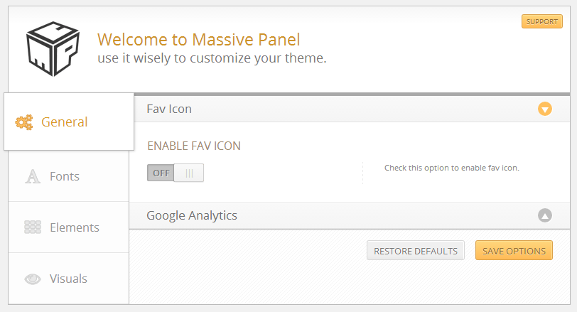
There is a video tutorial corresponding to this section of the documentation - Universal Video - Basic Theme SettingsAfter installation and activation it is time to set up your website. First thing you will notice is the 'Theme Options' Tab added into the WordPress Admin sidebar. This section contains all of the custom Blaszoks options (see image bellow). The default options set in the panel are similar to those in the ThemeForest preview.
We should jump right into the Massive Panel because this is the place where all the magic happens (to do this just click the 'Theme Options' tab).The Panel is divided into tabs (the buttons to the right) and accordions (inside each tab).
Notice: Before leaving the 'Theme Options' tab make sure to click the 'Save Options' button at the bottom of the panel, otherwise your changes will be lost.
General - top
In the first tab you will find all of the basic settings divided into few accordion sections:
Fav IconTurn ON the Enabled Fav Icon option to use a custom Fav Icon for your website. If you don't know what is fav icon please rear this.
Google AnalyticsIf you want to enable Google Analytics on your website check the Enable Google Analytics option and input your Google Analytics Code. If you don't know where to obtain this code please follow this link.
Demo WizardEnable this option if you want to hide "Demo Install" from your Wordpress Dashboard. Please notice that, since Blaszok version 3.4 this will only work if you have got MPC Importer plugin installed and activated.
Notice: Before leaving the 'Theme Options' tab make sure to click the 'Save Options' button at the bottom of the panel, otherwise your changes will be lost.
Fonts - top
Font FamilyIn this section you can specify font family for your websites. You can choose a font for Heading & Content.
Font SizeIn this sections specify the base font size, the other fonts will be increased accordingly.
Notice: If you want to use your own custom fonts, not listed in our settings page, you need to do it manually.
Notice: Before leaving the 'Theme Options' tab make sure to click the 'Save Options' button at the bottom of the panel, otherwise your changes will be lost.
Elements - top
Logo- Use Text Logo - when enabled you can specify a text logo which will be display in the left hand corner of the page. When disabled upload field will show up. You should use this field to upload your image logo.
- Upload Logo - Upload your logo here.
- Upload Retina Logo - Upload your retina logo here.
- Upload Mobile Logo - Upload your mobile logo here (leave empty to use default logo).
- Upload Retina Mobile Logo - Upload your retina mobile logo here (leave empty to use default logo).
- Upload Sticky Logo - Upload your sticky logo here.
- Upload Retina Sticky Logo - Upload your retina sticky logo here.
- Description - if you want to display the description for your logo this setting has to be checked. You can specify the description under Settings>General in the 'tagline' field.
In this section you can choose the default sidebar position for each content type.
- Default Sidebar Position - this first option will apply to all pages. That will be your starting position.
Please notice that you will be also allowed to change Sidebar position individually for each page via Edit Page settings.
HeaderHere you can specify:
- Main Header Layout - allows to determine which of header layout you want to use.
- Disable Menu Indicators - Specify if you want to display small indicators for multilevel menu.
- Enable Mega Menu - when enabled you can get a drop down menu with background image.
- Enable Search - specify if you want to display search in header.
- Enable Smart Search - Specify if you want to display smart search.
- Enable Sticky Header - Specify if you want to show sticky header at the top of page
- Sticky Header Offset - Specify the sticky header offset. Bigger value will delay the switch to sticky header.
- Enable Mobile Sticky Header - Specify if you want to show sticky header at the top of page on mobile.
- Enable Simple Menu - Specify if you want to display simple slide down mobile menu under the header. It will disable the side menu.
- Enable Simple Menu Label - Specify if you want to display "Menu" label for simple menu button.
- Enable Simple Buttons - Specify if you want to display simple buttons (only icon).
- Enable Vertical Center - Specify if you want to center header vertically.
- Header Padding - Specify your header padding (top, right, bottom, left). This option will be especially handy when you are planning to implement background image for Header area.
Here you can specify:
- Enable Secondary Header - Uncheck this option to disable secondary header.
- Secondary Header Layout - Choose one of secondary header layouts.
- Secondary Header Position - Choose secondary header position.
- Enable Subscribe Form - Uncheck this option to disable subscribe form.
- Secondary Header Message - Specify the message you want to display in place of subscribe form. Leave empty to display default subscribe form.
- Newsletter Text - Specify your newsletter message.
- Enable Secondary Header Menu - Check this option to enable secondary header menu.
- Secondary Header Padding - Specify Secondary Header padding (top, right, bottom, left).
Here you can specify:
- Enable Header Widget Area - Uncheck this option to disable header widget area.
- Header Widget Area Columns Number - Specify default number of header widget area columns.
Header widget area can be populated in Dashboard->Appearance->Widgets.
FooterHere you can specify:
- Enable Footer - Uncheck this option to disable footer.
- Set Footer Columns Number - Specify default number of footer columns.
- Enable Toggle Footer - Uncheck this option to disable mobile toggle footer button.
- Back To Top Position - Specify the position of "Back to Top" button.
- Footer Padding - Specify footer padding (top, right, bottom, left).
Here you can specify:
- Enable Extended Footer - Uncheck this option to disable extended footer.
- Extended Footer Columns Number - Specify default number of extended footer columns.
- Enable Toggle Extended Footer - Uncheck this option to disable mobile toggle extended footer button.
- Extended Footer Padding - Specify padding for extended footer (top, right, bottom, left).
- Enable Copyrights & Socials - Uncheck this option to disable copyrights/socials section below the footer.
- Copyrights Text - Here you can specify your copyright text it will be displayed at the aside section (at the bottom of menu)
- Copyrights Padding - Specify Copyrights padding (top, right, bottom, left).
Here you can specify your social icons they will be displayed just above the copyright note. Remember to paste URL to your social account. This options are also applied to "Social list" - a Visual Composer component.
- Open in New Tab - Check this option to open links in new tabs.
Visuals - top
ColorsChoose the main active color for your website from interactive palette of colors or paste your HEX value.
!!!Please notice that more specific color options are available in Theme options->Visuals->Display->Skin and Theme options->Styles.
DisplayChoose theme layout & theme skin.
- Enable Maintenance Mode - Check this option if you want to enable maintenance mode. You will need to choose the page which will be used for maintenance.
- Maintenance Page - Specify the landing page for maintenance mode. There is special designated template for that purpose. You can choose it from "Page attributes" while in Edit Page.
- Disable Responsive - Check this option if you want to disable responsive layout.
- Archive & Category Style - Choose layout for posts archive and category pages display.
- Full width thumbnails - Thumbnail will be streached to full width. Post title above image and post meta below text.
- Full width thumbnails alter - Thumbnail will be streached to full width. Post title below image and post meta below title.
- Small thumbnails - Small thumbnail will be surrunded by post text.
- Large Archive Thumbnails - Allows you to display archive thumbnails in page full width.
- Enable Excerpt Trim - Enable excerpt trim function for posts.
- Theme Layout Type - Choose one of following options:
- Full width - Maximum width of site will be same as browser window width.
- Boxed - Maximum width of site will be limited, but whole site still be responsive.
- Floating Boxed - Maximum width of site will be limited, whole site still be responsive but background will always stay the same.
- Skin - Choose one of 4 color presets for theme:
- Default
- Gray
- Gold
- Dark
- Enable Author Box - Turn this option ON if you want to display author box at all posts.
- Disable Mobile Sliders Navigation - Uncheck this option if you want to display sliders navigation on mobile devices.
- Disable Buttons Border Color - Check this option if you want to disable buttons border color.
You can setup theme background for "Boxed Layout":
- Type
- None
- Color- whole background will be filled with solid colid.
- Pattern Background - selected pattern will be repeat to fill whole background.
- Custom Background - select your own image, it can also be repeated.
- Background Image - Choose or upload your background image.
- Repeat Background - Enable to use image background as pattern.
Our template has support for MegaMenu backgrounds:
- Background Image - Upload your dropdown background image here.
- Padding - Specify your dropdown padding you can set only 3 values here: right, bottom and left.
- Alignment - Select background type for your site.
Here you can turn off add to cart functionality, cart or pices so you can use woocommerce as a prodcut catalogue without selling anything.
Here you can specify:
- Products Number - amount of products per page.
- Masonry Shop - use this option if you want to turn on the Masonry for your shop.
- Load More - use this to turn on the load more feature for the Masonry shop.
- Shop Style - select shop list style
- Shop Columns Number - Specify default number of shop columns for default style.
- Products Slider Style - Choose one of products slider styles.
- Product Accordions - Check this option if you want to change tabs to accordions for products descriptions.
- Size Guide - Check this option if you want to enable size guide for products.
- Disable Header Cart - disables the cart in the header.
- Replace Header "SUBTOTAL" - Use this field to replace "SUBTOTAL" in the header cart button.
- Disable "Add to Cart" - disables the add to cart functionality.
- Disable Products "Price" - once you disable the "Add to cart" you get the option to also disable the price of the product.
- Disable Products Hover Effect - disables the product hover effect globally.
- Enable Related Products - Enable this in order to display "Related Products" at single product page.
- Disable SKU display - disables SKU information display at single product page.
- Disable Categories display - disables product Categories list display at single product page.
- Disable Tags display - disables product Tags display at single product page.
- Disable Share buttons - disables Share buttons for product at single product page.
- "Description" Tab Label - specify your custom label for product "Description" label.
- "Additional Information" Tab Label - specify your custom label for product "Additional Information" label.
Custom CSS
Here you can add the custom CSS.
Notice: Please note that if you add wrong CSS code you can break your site.
Overwrite Shortcodes ColorsEnable it in order to force theme "Main Color" on shortcodes.
Styles - top
OptionsHere you can specify:
- Use Advance Colors - Check this option if you want to use the below colors.
- Use Advance Font Sizes - Check this option if you want to use the below font sizes.
Here you can specify:
- Enable Background Image - Check this option if you want to use Header background image. It will trigger additional settings:
- Background Image - Upload or choose from library your background image.
- Repeat Background - Choose other then "None" if you want to use image as pattern.
- Background Size - Set up your background image size inside container.
- Background Align - Set up your background image alignment inside container.
- Header Background - Specify header background color.
- Header Border - Specify header border color.
- Header Font - Specify header font color.
- Header Active/Hover - Specify header active/hover color.
- Header Menu - Specify header menu font size.
- Header Button - Specify header button font size.
Here you can specify:
- Secondary Header Background - Specify secondary header background color.
- Secondary Header Border - Specify secondary header border color.
- Secondary Header Font - Specify secondary header font color.
- Secondary Header Active/Hover - Specify secondary header active/hover color.
- Secondary Header - Specify secondary header font size.
Here you can specify:
- Enable Background Image - Check this option if you want to use Header Widget Area background image. It will trigger additional settings:
- Background Image - Upload or choose from library your background image.
- Repeat Background - Choose other then "None" if you want to use image as pattern.
- Background Size - Set up your background image size inside container.
- Background Align - Set up your background image alignment inside container.
- Header Widget Area Background - Specify header background color.
- Header Widget Area Border - Specify header border color.
- Header Widget Area Font - Specify header font color.
- Header Widget Area Active/Hover - Specify header active/hover color.
- Header Widget Area Heading Border - Specify header widget area heading border color.
- Header Widget Area Header - Specify header widget area header font size.
- Header Widget Area Content - Specify header widget area content font size.
- Header Widget Area Small - Specify header widget area small font size.
Here you can specify:
- Dropdown Background - Specify dropdown background color.
- Dropdown Border - Specify dropdown border color.
- Dropdown Font - Specify dropdown font color.
- Dropdown Active/Hover - Specify dropdown active/hover color.
- Header Dropdown - Specify header dropdown font size.
- Secondary Header Dropdown - Specify secondary header dropdown font size.
Here you can specify:
- Search Background - Specify search background color.
- Search Border - Specify search border color.
- Search Font - Specify search font color.
- Search Active/Hover - Specify search active/hover color.
- Search - Specify search font size.
Here you can specify:
- Sidebar Background - Specify sidebar background color.
- Sidebar Border - Specify sidebar border color.
- Sidebar Font - Specify sidebar font color.
- Sidebar Active/Hover - Specify sidebar active/hover color.
- Sidebar Heading Border - Specify sidebar heading border color.
- Sidebar Header - Specify sidebar header font size.
- Sidebar Content - Specify sidebar content font size.
- Sidebar Small - Specify sidebar small font size.
Here you can specify:
- Content Background - Specify content background color.
- Content Border - Specify content border color.
- Content Font - Specify content font color.
- Content Active/Hover - Specify content active/hover color.
- Content Heading Border - Specify content heading border color.
- Content Header - Specify content header font size.
- Content Content - Specify content font size.
- Content Small - Specify content small font size.
Here you can specify:
- Enable Background Image - Check this option if you want to use Footer background image. It will trigger additional settings:
- Background Image - Upload or choose from library your background image.
- Repeat Background - Choose other then "None" if you want to use image as pattern.
- Background Size - Set up your background image size inside container.
- Background Align - Set up your background image alignment inside container.
- Footer Background - Specify footer background color.
- Footer Border - Specify footer border color.
- Footer Font - Specify footer font color.
- Footer Active/Hover - Specify footer active/hover color.
- Footer Heading Border - Specify footer heading border color.
- Footer Header - Specify footer header font size.
- Footer Content - Specify footer content font size.
- Footer Small - Specify footer small font size.
Here you can specify:
- Enable Background Image - Check this option if you want to use Extended Footer background image. It will trigger additional settings:
- Background Image - Upload or choose from library your background image.
- Repeat Background - Choose other then "None" if you want to use image as pattern.
- Background Size - Set up your background image size inside container.
- Background Align - Set up your background image alignment inside container.
- Extended Footer Background - Specify extended footer background color.
- Extended Footer Border - Specify extended footer border color.
- Extended Footer Font - Specify extended footer font color.
- Extended Footer Active/Hover - Specify extended footer active/hover color.
- Extended Footer Heading Border -Specify extended footer heading border color.
- Extended Footer Header - Specify extended footer header font size.
- Extended Footer Content - Specify extended footer content font size.
- Extended Footer Small - Specify extended footer small font size.
Here you can specify:
- Copyright Background - Specify copyright background color.
- Copyright Border - Specify copyright border color.
- Copyright Font - Specify copyright font color.
- Copyright Active/Hover - Specify copyright active/hover color.
- Copyright - Specify copyright font size.
Content - top
To create pages or posts click the Pages/Posts tab in the WordPress Admin Panel. To create new posts/pages click the 'Add New' button.
Creating Pages - top
There is a video tutorial corresponding to this section of the documentation - Universal Video - Menu Setup & Homepage
To create pages click the Pages tab in the WordPress Admin Panel. To create new page click the 'Add New' button.
NOTICE: For each page you can choose a 'Page Template', Blaszok theme adds four new page templates: Blog (use it for all of the pages that will display posts), Portfolio used for the pages that will display the portfolio post types, Full Width used to display full width slider or parallax in the content section, Lookbook is used do display the lookbooks/catalogues as a page. Each of the pages comes with some additional page settings.
Maintenance Page template is especially designated to create page for Theme Options->Visuals->Display->Enable Maintenance Mode feature. Page created with this template will not contain header or footer.
If you want your Home page to display posts, create your home page in the Page tab choose 'Blog' as page template, publish your page. Go to Settings>Reading and for the Front Page Displays choose 'A Static Page' and for the Front Page choose the page you have just created, the 'Posts Page' drop down leave blank
Each of the posts and pages have some additional settings under the main content section, please make sure to check them out there are many cool features. Please see the screen shot bellow to make sure that you know where to find them:
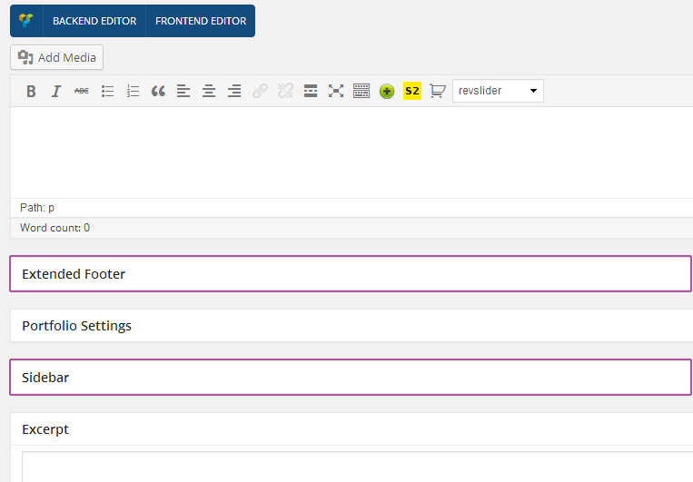 There are some additional settings that are shared between all of the page templates:
Each of the pages/post/portfolio have three sidebar settings: none/right/left. This setting specifies the position of the sidebar on the page
FooterEach of the pages/post/portfolio types have an ability to:
- Hide the footer.
- Hide the extended footer.
- Hide the copyrights.
Here you can hide the title of your post type or page that is outputted by default.
Header Image BackgroundYou can trigger additional Header background options for this particular page, despite the global Theme options->Styles for whole website.
Footer Image BackgroundYou can trigger additional Footer Image background options for this particular page, despite the global Theme options->Styles for whole website.
Extended Footer Image BackgroundYou can trigger additional Extended Footer background options for this particular page, despite the global Theme options->Styles for whole website.
There is a video tutorial corresponding to this section of the documentation - Universal Video - Sidebar Settings, Creating Unique Sidebars & Widgets Blog Settings - page templates additional settings:- Layout - choose between four layout types Full Width Thumbnails, Full Width Thumbnails alternative, Small Thumbnails, Masonry and Masonry with Load More.
- Limit Visible Categories - here you can choose which categories to display on this page.
- Display Posts Number - here you can specify number of displayed posts.
- Portfolio Columns - choose 1-4 columns to display your portfolio posts.
- Load More - Check this if you want to display load more as pagination.
- Enable Category Filter - if you check this option this page will have categories filter buttons at the top.
- Limit Visible Categories - here you can choose which categories to display on this page. To Create a portfolio page just choose a portfolio page template set up the Portfolio settings and hit publish. Once you have a portfolio page you need to populate it with portfolio items. To do so go to Portfolio>Portfolio Items and add your portfolio items, make sure each one of them has a featured image set up.
- Header Content - here you can paste for example a shortcode for Slider Revolution to display it at full width just below the menu (like on the most home pages on Blaszoks preview).
This theme has a great addition called Visual Composer, the visual composer lets you use a beautiful drag & drop interface to create your pages, add shortcodes etc. To enable the visual composer just click the Visual Composer button at the top of the page (please see the image bellow).
To learn more about Visual Composer please read this or view this video.
Creating Posts - top
There is a video tutorial corresponding to this section of the documentation - Universal Video - Blog & Posts
To create posts click the Posts tab in the WordPress Admin Panel. To create new post click the 'Add New' button.
For each post you can choose a 'Post Format'. Blaszok theme supports 9 post formats.
Each of the posts and pages have some additional settings under the main content section, please make sure to check them out there are many cool features. There are some additional settings that are shared between all of the posts formats:
Sidebar SettingsEach of the pages/post/portfolio have three sidebar settings: none/right/left. This setting specifies the position of the sidebar on the page
FooterEach of the pages/post/portfolio types have an ability to:
- Hide the footer.
- Hide the extended footer.
- Hide the copyrights.
- Hide Post Thumbnail - Check this if you want to hide the default full width thumbnail for this post.
- Show Author Box - Enable this if you want to show the Author box for this post.
You can trigger additional Header background options for this particular post, despite the global Theme options->Styles for whole website.
Footer Image BackgroundYou can trigger additional Footer Image background options for this particular post, despite the global Theme options->Styles for whole website.
Extended Footer Image BackgroundYou can trigger additional Extended Footer background options for this particular post, despite the global Theme options->Styles for whole website.
Visual ComposerThis theme has a great addition called Visual Composer, the visual composer lets you use a beautiful drag & drop interface to create your pages, add shortcodes etc. To enable the visual composer just click the Visual Composer button at the top of the page (please see the image bellow).
To learn more about Visual Composer please read this or view this video.
Creating Portfolio - top
To create portfolio click the Portfolio tab in the WordPress Admin Panel. To create new portfolio item click the 'Add New' button.
Each of the portfolio have some additional settings under the main content section, please make sure to check them out there are many cool features. Please see the screen shot bellow to make sure that you know where to find them:
 There are some additional settings that are shared between all of the page templates:
Each of the pages/post/portfolio have three sidebar settings: none/right/left. This setting specifies the position of the sidebar on the page
FooterEach of the pages/post/portfolio types have an ability to:
- Hide the footer.
- Hide the extended footer.
- Hide the copyrights.
You can trigger additional Header background options for this particular post, despite the global Theme options->Styles for whole website.
Footer Image BackgroundYou can trigger additional Footer Image background options for this particular post, despite the global Theme options->Styles for whole website.
Extended Footer Image BackgroundYou can trigger additional Extended Footer background options for this particular post, despite the global Theme options->Styles for whole website.
Portfolio MetadataHere you can add some metadata for your portfolio, for example year, model, artist. Click 'Add Row' to create additional row. After that remember to add Visual Composer component called 'Portfolio Metadata'.
Visual ComposerThis theme has a great addition called Visual Composer, the visual composer lets you use a beautiful drag & drop interface to create your pages, add shortcodes etc. To enable the visual composer just click the Visual Composer button at the top of the page (please see the image bellow).
To learn more about Visual Composer please read this or view this video.Post Formats - top
In the previous section, we have explained the basics of the post formats and theirs additional settings (if you haven't read it please do). Below I will go over all of the post formats and explain it's additional functions.
Standard Standard post with an image.- Lightbox Settings - here you can specify a lightbox for the post.
This post format should be used as a short note on your blog. The title of the post wont be displayed. This format also doesn't have any additional settings.
GalleryThe gallery post formats uses selected images and displays them in a slider.
- Gallery Images - here you can specify the images that will be displayed inside the slider in a single view.
This format has one additional field called Link URL in this field you should specify the URL you would like to share, the title of the post will used as the title for the link. It can be also used for commercial/ads/banners display with 'Use as banner' option introduced at Blaszok 3.1
StatusThe status post format is a great way to display single tweet, it comes with one additional field Twitter Embed where you can embed the tweet.
QuoteThis post format lets you display quote in a beautiful way, you should specify the quote in the additional field called Quote Text and quote author in a Quote Author field.
AudioThis post format lets you display an audio player at the top of the post, you have three additional fields to use: MP3 file - this field specifies the mp3 source for the audio player, OGG file - this field specifies the ogg source for the audio player. Also there is drop down which enables you to specify if you want to upload the audio file or embed it.
Video This post lets you display a video player at the beginning of your post. You can embed the video from vimeo, youtube etc. or upload your own as MP4, OGG file. ChatTo display a chat conversation please use this post type, to add chat bubles use the Chat section, to add new transcripts please use the add row button.
There is a video tutorial coresponding to this section of the documentation - Universal Video - Blog & PostsCreating Menu - top
There is a video tutorial corresponding to this section of the documentation - Universal Video - Menu Setup & Homepage This video does not explain how to setup the Mega MenuTo setup the Menu first you need some pages, if you haven't setup any yet please see the first section of this chapter.
Once all your pages are created (of course you can edit/add/remove them at any point) go to the Appearance>Menus to create your new menu.- Type the name of your menu in the 'Menu Name' field at the top of the panel (the name doesn't really matter it can be e.g 'My Menu') then click the blue button 'Create Menu'.
- Now the 'Pages' panel in the left hand side is active and you can add some pages to your menu, just choose the pages you would like to add and click the 'Add to Menu' button.
- If you want to add single posts, products or portfolio items to the menu you would need to click the 'screen options' button in the top right section of the screen then check ex. 'portfolio' and it will appear just bellow the pages (you add those items in the same fashion as pages).
- Once the menu is setup click the blue 'save menu' button.
- Last thing you need to do is assigning new menu to your theme. Click the 'Manage Locations' tab and for the 'Main Navigation Menu' choose your newly created menu 'save'.

Now your menu is created and should be visible in the header of your theme.
Enabling Mega Menu - top
To setup the mega menu first you must install the jQuery Mega menu from the recommended plugins list, if you don't know how to do this, please view this section. After installing the plugin you will have to enable the mega menu functionality inside the Theme Options, to do so please go to Theme Options>Element>Header and make sure that the 'Enable Mega Menu' is set to 'true'.
Now once the Mega Menu is enabled it is time to create the menu in Appearance>Menus (if you previously created the menu just make sure that it meets the Mega Menu Standards.) This is how the Mega Menu Works:

It is really important to makes identical links structure as shown above to avoid complication with "Dropdown Backgrounds".
So as you can see the first level items of your menu resemble the main level of the menu. This mean that those links will shown as your main navigation menu. The second level resembles the header of the column and finally the 3rd level resembles the menu item inside the column.
When your menu is ready, go to Manage Location tab and make sure that you have selected this menu as Main Navigation Menu. Look at image below.

Once you setup the menu it is time to add it as your mega menu please go to Appearance>Widgets, you will notice new widget area called Main Menu and a new widget Called jQuery drag the Mega Menu widget inside the new Widget area.

Inside the widget you will find few additional settings:
- Title - leave it blank
- Select Menu - here you need to select the previously created menu
- Click/Hover - Choose hover
- Skin - No theme for the default styling
- Animation Effect - choose fade In
- Animation Speed - choose normal
- Set Sub Menu To Full Width - need to be unchecked
After that you are done. The menu will be displayed in your gorgeous new header!
Adding Dropdown ImagesTo add images to your drop downs please go to Theme Options > Visuals > Dropdowns Background. If there is no option "Dropdown backgrounds", make sure that all the earlier steps are made correctly. There will be displayed each top level element from your menu. For each of the elements you can choose an image and padding.
If your looks good as background, you will probably not need to set up padding. In case when your links cover important part of background, follow the steps bellow.
Padding is set as right, bottom, left, so if you set it for example to: 10px 15px 20px, you will end up with:
padding right = 10px;
padding bottom = 15px;
padding left = 10px;
Why is this so important? Take a look at image below to better understand the purpose of setting padding for background image. This process can take a while but when you do it right the effect will be amazing!
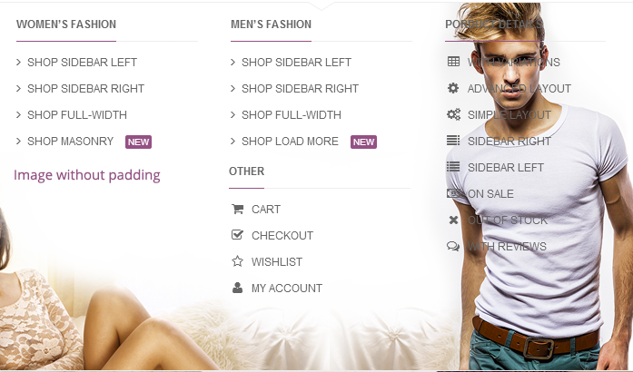

Once you set up your pictures & save your gorgeus new dropdowns are ready to be used.
Adding Icons To The MenuTo add icons to the menu you need to add a little code before the page item name, this could looks like this:
Menu Item Title
It is very easy to change the icon all you need to do is swap the 'fa-desktop' with any of the names from this list (without the code in the brackets).
Creating Secondary Menu - top
To setup the Menu for Secondary header, first you need some pages, if you haven't setup any yet please see the first section of this chapter.
Once all your pages are created (of course you can edit/add/remove them at any point) go to the Appearance>Menus to create your new menu.- Type the name of your menu in the 'Menu Name' field at the top of the panel (the name doesn't really matter it can be e.g 'My Secondary Menu') then click the blue button 'Create Menu'.
- Now the 'Pages' panel in the left hand side is active and you can add some pages to your menu, just choose the pages you would like to add and click the 'Add to Menu' button.
- If you want to add single posts, products or portfolio items to the menu you would need to click the 'screen options' button in the top right section of the screen then check ex. 'portfolio' and it will appear just bellow the pages (you add those items in the same fashion as pages).
- Once the menu is setup click the blue 'save menu' button.
- Last thing you need to do is assigning new menu to your theme. Click the 'Manage Locations' tab and for the 'Secondary Navigation Menu' choose your newly created menu 'save'.

Now your menu is created and should be visible in the secondary header of your theme.
Notice:Secondary Header Menu has no provide support for MegaMenu but is still supporting multi level menu.
Adding Parallax Sections - top
To add a parallax section make sure you have installed the Visual Composer plugin and enabled it for post, pages, portfolios and prodcuts. To add a parallax section to a page (it is the same for posts, portfolio etc.) open up the editor of the page and enable the backend editor fromvisual composer (See image below).

Then add a new row and edit the pencil to edit the row (See image below).
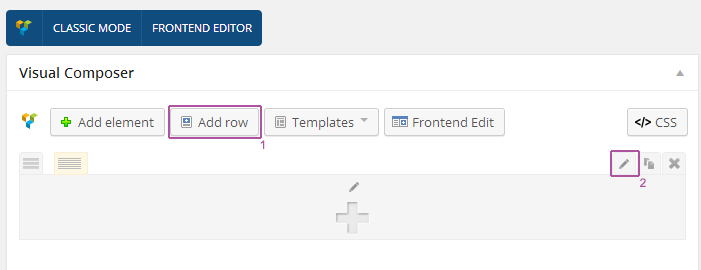
Once you click the pencil icon a popup will appear with tones of options (See image below), at the first tab "General" you will see:
- Font Color - setup font color for your parallax,
- Overlay color - if your image for example is to light and the text is not visible you can add a dark overlay to it
- Overlay color Opacity - here change the opacity of the overlay 0-100
- Pattern Overlay - here you can add a pattern overlay to the image
- Pattern overlay opacity - change opacity of the pattern 0-100
- Full Width - check this if you want this section to be 100% width of the browser
- Parallax - check this to enable parallax
- CSS Animation - select one of the animation effect for this section
At the second tab "Design options" you can set background for your section:
- Border - select color and border style
- Background - here you can set a color and image for your section. If the image is not big enough to fill whole screen you can also make them repeatable from dropdown menu.
- Padding, margin and border width - to make your parallax bigger then the content inside you can stretch it with padding, the accepteble format it (top, right, bottom, left) for example: 10px 0px 15px 25px
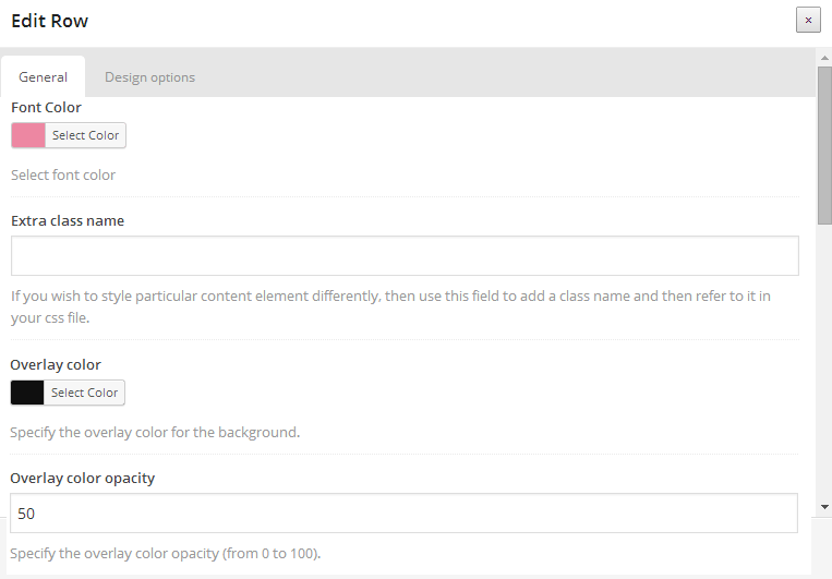
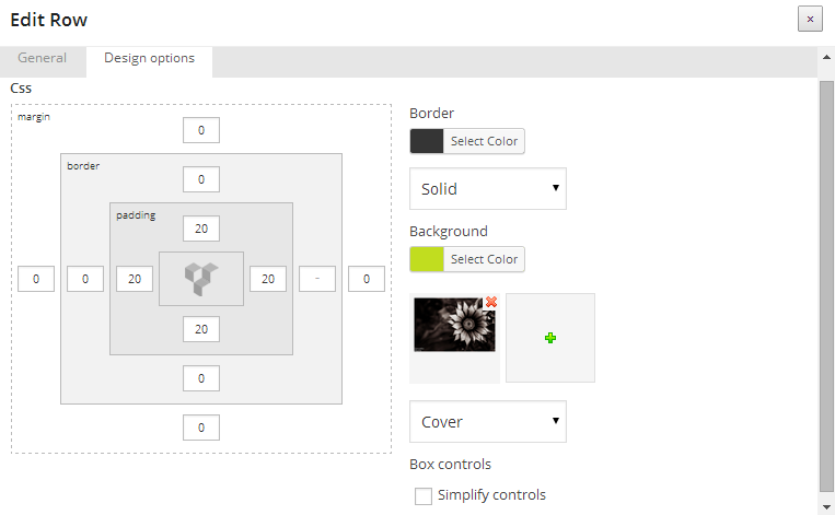
The last step would be to add some content to your row which will be displayed inside the parallax.
After those steps you are done and your beautiful parallax is ready.
Contact Form 7 template - top
Our awesome theme has got prepared template for Contact Form 7 plugin! If you want it at your website, please follow the steps below.
Step 1. Go to Appearance->Plugins and search for 'Contact Form 7', install and activate plugin.
Step 2. Make sure that you have installed Wordpress Importer tool. If not, install it through Tools->Import, select Wordpress, click install and activate.
Step 3. Select 'blaszok-contact-form.xml' file from theme package. This file is located in 'import' folder. Click "Upload and import file" to finish process.
Step 4. At next screen, you should see a form titled Assign Authors. If you do not want to create new accounts, you should change both mpcreation and mikey_influx to your account name from dropdown menu.
Last step! Go to your contact page edit screen and select Visual Composer component called "Contact Form 7", select newly added contact form and click Save. Another way to do this is go to Contact->Contact Forms and copy shortcode code. Now, you can paste it in contact page..

Comments - top
For each of your pages/post you can disable/enable comments to do this go to the edit page of your post/page. Click on the 'Screen Options' at the top and check 'Discussion' then at the bottom of the page the 'Discussion' field will occur where you can manage comments, please see bellow.
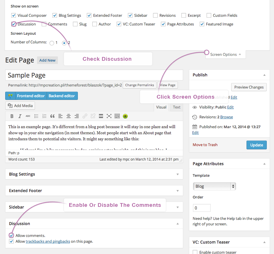
Addons - top
Blaszok provides support for plenty of different addons for your page. If you are looking for shortcodes, Visual Composer components, sliders this section is definitely for you.
Additional page settings - top
Site layout
- Site layout - select the page layout from Fullwidth, Boxed or Floating Boxed for single view. Leave Default to use the default layout.
 Sidebar
- Custom Sidebar Position - Check this if you want to specify custom position for this post sidebar.
- Sidebar Position - Select the position of sidebar for this single post.
Footer
- Hide Extended Footer - Check this if you want to hide extended footer for this page.
- Hide Footer - Check this if you want to hide footer for this page.
- Hide Copyright - Check this if you want to hide copyright for this page.
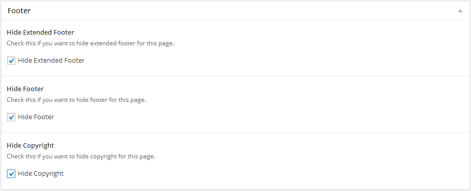 Page Header - only for Fullwidth, Fullwidth with sidebar and Lookbook page template
- Header Content - This content will be displayed at the top of the page.
- Hide Title - Check this if you want to hide page title.
- Force Header Full Width - Check this if you want to force full width display of page menu.
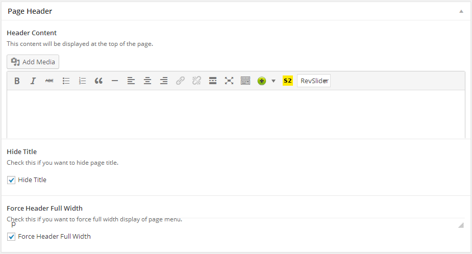 Transparent Header - only for Fullwidth, Fullwidth with sidebar and Lookbook page template
- Enable Transparent Header - Check this if you want to move header section under transparent page menu.
- Force Simple Buttons - Check this if you want to display header buttons as icons.
- Vertical Center Elements - Check this if your want to vertically center the logo, menu and buttons.
- Force Font Color - Specify the header font color.
- Force Background Color - Specify the header background color.
- Background Opacity - Specify the percentage value of header background opacity.
- Force Font Color - Sticky - Specify the sticky header font color.
- Force Background Color - Sticky - Specify the sticky header background color.
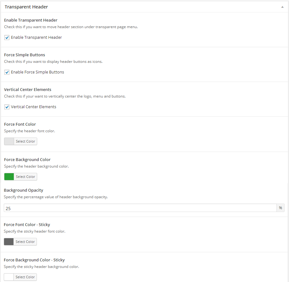 Page Settings - only for Default page template
- Hide Title - Check this if you want to hide page title.
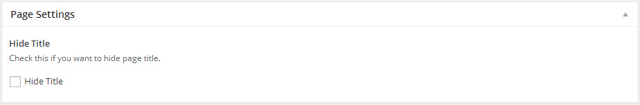 Blog Settings - only for Blog page template
- Layout - Select blog layout.
 Post Settings - only for Posts
- Hide Post Thumbnail - Check this if you want to hide the default full width thumbnail for this post.
Inline Shortcodes - top

Blaszok Theme comes with awesome Inline Shortcode Wizard (aside from Visual Composer) where you can customize your shortcodes and preview them before inserting into post/page. The Shortcode Wizard is powered by Tinymce this gives it the ability to have a special button for theme shortcodes in the Post/Page visual editor.
To enter the Shortcode Wizard click on the green icon with a plus on it, a drop down will show up. All of the shortcodes are listed there: Highlight, Dropcaps, Tooltip, Lightbox.
Visual Composer Addons/Shortcodes - top
To add any of the shortcodes or addons please go to visual composer, add new row and click the add button, to learn more about visual composer please read it's documentation here.

If you have trouble in setup for our custom Visual Composer components please read this detailed tutorial below. Please make sure that you carefully read the offical documentation of Visual Composer before you start.
Icon listThis component allows you to add a list of items with an colorful icon for each position:
- Icon Color - select color for icon
- Text Color - select color for text
- List items - here you can add items to your list. If you click button near to text field you also can choose icon for this element.
 Social list
This component allows you to add a list of your social media profiles represented by small icons:
- Title - text to display before list of social media icons
This component allows you to add a list of portfolio metadata. This element has not have any additional parameters. Metadata can be set in Portfolio Metadata section at edit screen of Portfolio post type.
Testimonials sliderThis component allows you to add a slider with testimonials. To add first testimonial to slider insert author name and testomonial text into form. Testimonials can be managed by using small buttons near the author field. If you want more testimonials in slider you can click at "plus" or "duplicate" button. To delete single testimonial click "trash" icon.
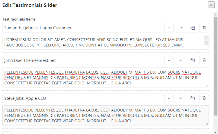 Products slider
This component allows you to add a slider with products:
- Type - determines how component should select products:
- Recent - shows latest added products,
- Best sellers - shows best selling products,
- Top rated - shows best rated products (WooCommerce ratings need to be enable),
- Related - shows related products,
- Random - shows set of random products
- Number - quantity of products to show in slider
- Category - shows only products from specified category
- Tag - shows only products with specified tag
- Simple Arrows - Enable simple arrows
 Products categories slider
This componnent allows you to add a sliders for categories of products:
- Filter - here you can specify which category you want to include in slider. Remember to use category slug instead of category name.
- Simple Arrows - Enable simple arrows
Thumbnail for each category can be added in 'Products->Categories'. Posts slider
This component allows you to add a slider with blog posts:
- Type - determines how component should select posts:
- Recent- shows latest added posts,
- Related - shows related posts,
- Random - shows set of random posts
- Number - quantity of posts to show in slider
- Category - shows only posts from specified category
- Tag - shows only posts with specified tag
- Rows - determines how many posts rows you want to display in the slider
- Simple Arrows - Enable simple arrows
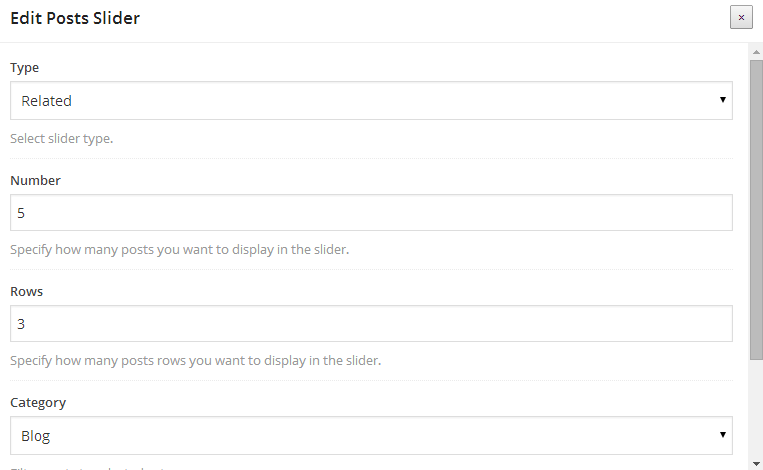 Portfolio slider
This component allows you to add a slider with portfolio items:
- Type - determines how component should select portfolio items:
- Recent- shows latest added portfolio items,
- Related - shows related portfolio items,
- Random - shows set of random portfolio items
- Number - quantity of portfolio items to show in slider
- Category - shows only portfolio items from specified category
- Tag - shows only portfolio items with specified tag
- Simple Arrows - Enable simple arrows
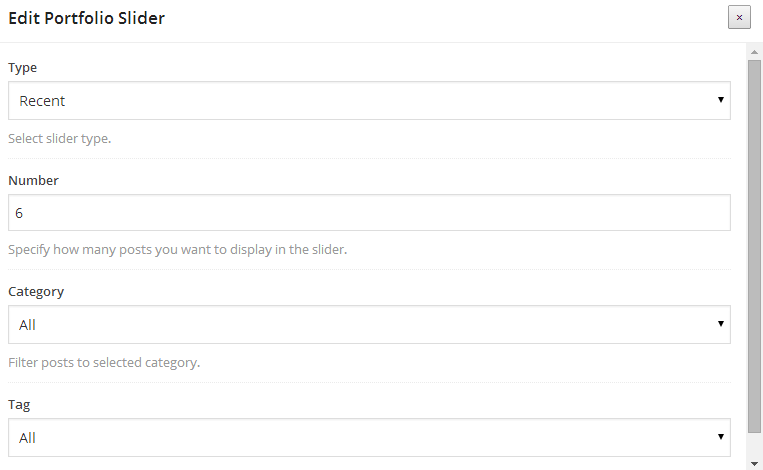 Images slider
This component allows you to add a slider with selected images:
- Images - allows you to select existing or upload new images for slider. Order of images can be edited by dragging images into new position.
- Images URLs - insert URL links for each image in new line. After this, images will work as hyperlinks.
- Brands - Display as brands slider.
- New Tab - Open in new tab.
- Simple Arrows - Enable simple arrows.
 Counter
This component allows you to add a nice looking counter to the content:
- Begin number - specify beginning number
- End number - specify ending number
- Color - specify counter color
- Font size - specify custom font size
- Alignment - specify counter alignment
 Countdown
This component allows you to add a nice looking time countdown to the content. Perfect for Maintenance Mode:
- End Date - Specify ending date.
- Color - Specify counter color.
- Font size - Specify custom font size.
- Countdown format - Specify the countdown format: O - months, W - weeks, D - days, H - hours, M - minutes, S - seconds.
Deco header
This component allows you to add a nice looking header with your own text:
- Type - determines how header will look like - mainly font size:
- Text - specify header text you want to shows
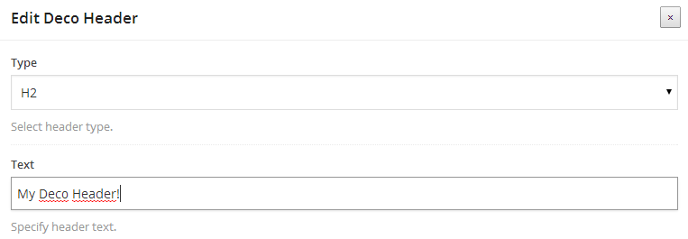 Icon
Icon
This component allows you to add a icon to the content:
- Icon - determines which icon will shown in header
- Icon color - specify a color icon
- Title - title text for column
- Text - text to fill column
- Link - specify URL address for column
 Icon column
This component allows you to add a column filled by text, with icon in header:
- Icon - select your icon
- Color - select icon color
- Size - specify custom icon size
- Alignment - specify icon alignment
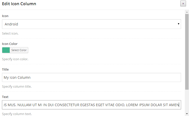 Code wrapper
This component allows you to add a source code block with proper structure:
- Source Code Text - source code to display
This component allows you to add a quote block with author:
- Quote text - quote text to display
- Author - specify the author of quote
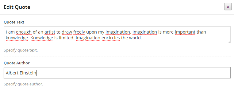 Countdown
This component allows you to add a Countdown. Perfect for Maintenance Mode:
- End Date - Specify ending date.
- Color - Specify counter color.
- Font Size - Specify custom font size.
- Style - Select countdown style.
- Alignment - Select countdown alignment.
This component allows you to add a Newsletter Box. Perfect for Maintenance Mode:
- Newsletter plugin - Select newsletter plugin. (MailChimp or Subscribe2)
- Alignment - Select countdown alignment.
This component allows you to link the whole VC row to a URl. Please notice that you need to put Row inside this element, then you can the simple VC shortcodes like TextBlock, Single Image etc:
- URL - Specify URL for this link wrapper.
- New Window - Enable to open URL in new window.
Essential Grid - top
Blaszok comes with bundled Essential Grid which is the most popular grid plugin on the market today. To learn how to use it please read it's documentation here.
You can easily import all grids from our preview sites. Ess. Grid import JSON files are in package obtained from ThemeForest, it is located in import catalog. You will need to unzip package before importing grids from Wordpress admin panel:
- go to Ess. Grid->Import\Export,
- click into "Import:" field - it should trigger option to upload file from your computer,
- after choosing and uploading JSON file you will need to click "Read file"
- now you should be able to choose grids and grid elements of your preferention (if you want ot recreate preview site grid we recommend to choose all elements)

- before clicking "Import Selected Data" you can choose either to "Append As New" or "Overwrite Existing" - we recommend to overwrite

- overwriten grids should be displayed in Dashboard->Ess. Grid->Ess. Grid with number that contain time and date
Pricing Table - top
Blaszok comes with bundled CSS3 Pricing Table which is the most popular pricing table plugin on the market today. To learn how to use it please read it's documentation here. Once you create a pricing table that you like, you can add it by pasting the shortcode inside a textfield (we will be adding a visual composer shortcode for this soon!).
Get Kudos - top
To enable the get kudos plugin first you need to create an account here. Then login and go to the display tab to setup your widget. Once you set it up you need to add it to your website to do so login to your WordPress dashboard and click on the 'GetKudos' button. Once you fill out the information the widget should be displayed on your page! If you don't see the GetKudos in your admin panel that mean that you haven't installed it, to learn how to do this please see click here.
Lookbooks / Catalogue - top
Lookbook are based on a Slider Revolution. Simply the lookbook is nothing more then a slider with an price tag added to it. If you want to learn how to use Slider Revolution please read this. To create the lookbook, create a slider consisting of only one slide (or more if you want) add you price tags to it, links etc. Then copy the sliders shortcode (or use the visual composer to add the visual composer to the page). Go to Pages>Add New and create new page which will contain your lookbook, for the page template choose 'lookbook'. Below the content area the 'Header Content' field will show up, paste the previously copied shortcode here and hit publish. The look book will be displayed at the top of this page if you want to add some information below the lookbook add them to the content section of this page.
Creating the price badgeTo create the price badge (while in the edit slide mode) click the add new Layer button. Clear the Style drop down and for the Text / Html place the following code:
			$219
			Sexy White Dress
The Code is fairly simple so don't be scared:
- in the style attribute of first element (anchor tag) you can set the color of the badge and popup. Please set the same color for both background-color and border-color.
- The first span respembles the price of the item just change the '$219' to anything you like.
- The second span elment resembles the tool tip info so replace the 'Sexy White Dress' with anything you like.
- To link the badge to the product replace the '#' from the first tag by URL of your product
If you want to achive a two line badge please use the code bellow:
			From:
			$219
			Accessories
The finall element will look something like this.
Smart Search - top
To create your smart search query please make sure that the WooCommerce plugin is installed (Smart Search wont work without it). Make sure that the smart search is enabled inside the 'Theme Options>Elements>Smart Search'. Go to 'Appearance>Widgets'. You will see a new widget area called Smart Search, from there build your smart query using the MPC Smart Search widget. Inside it you can specify the filter element (attribute/catgory), default value and a text that will be displayed before of after it.
Image Grid Layout - top
Image Grid Layout is a new feature in Blaszok 1.4.0 that allows you to setup a grid with hyperlinks and images like in the picture below.
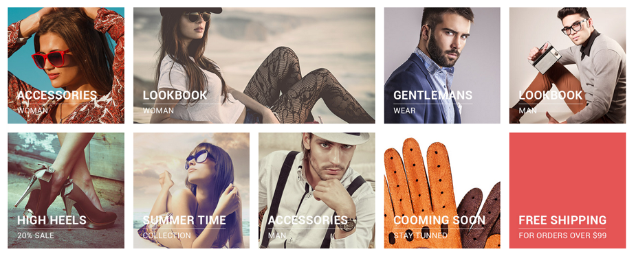
Here is the explanation how to use it:
- First of all, please make sure that you enabled Visual Composer support for mpc_grid post type at 'Settings->Visuals Composer'.
- Then please go to 'Grid->Add new'.
- Enable Backend Editor for Visual Composer and add VC element named Grid Image. Here you can select the image, title, subtitle. You can add as much Grid Images as you want.
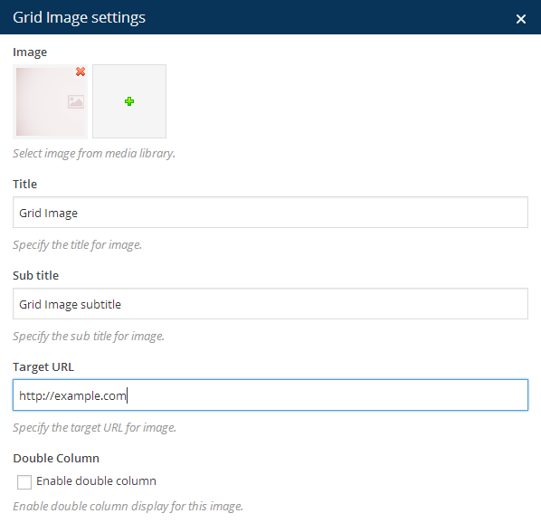
Here is an example Visual Composer Row for 3 grid images:
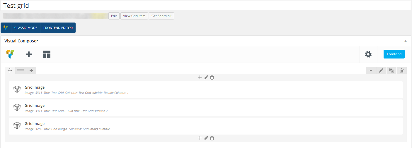
After you finish Grid Images setup please click Publish to save the Grid.
Next, please go to your page where you want the Grid Layout and select Visual Composer element named Grid. Your newly created Grid should be selected from dropdown.

OnePage Scroll To Element - top
First, you need to choose Row from Visual Composer that you want to use as a scroll reference. Then please go to Row edit and fill the Custom ID field with unique value, for example 'hello'. Please remember this value because it will be needed in the next step. You can have as many scroll references as you want but please notice that the Row used as a reference should be high enough to achieve the best look possible.

In next step, please go to Appearance->Menus and create new menu for your OnePage Scroll layout. Please add a custom link to your menu like in the picture below. Please remember to set the link in this format: '#YOUR_UNIQUE_ID_FROM_ROW', in our case it will be '#hello'. In the Label field you can write anything you want.
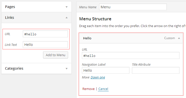
Notice: Please notice that you need to add more than one scrolling section to your page to make scroll working and the content must be higher than the browser window.
MailChimp support - top
If you want to use MailChimp instead of Subscribe2 plugin please follow these steps:
- Deactivate Subscribe2 plugin.
- Install and activate MailChimp plugin.
HTML code for MailChimp sign up form is included in 'import' directroy.
Sliders - top
Blaszok comes with bundled Layer Slider 5 which is in my opinion the most beautiful slider out there with parallax features, advanced animation and tones more. To learn how to use it please read it's documentation here. Once you create a slider that you like, you can add it by pasting the shortcode inside a textfield or by simply using the visual composer shortcode. Layer Slider also comes with 3 pre-made slider that you can learn from, they are very easy to import.
Slider Revolution - top
Blaszok comes with bundled Slider Revolution which is one of the best and most advanced sliders on the market. To learn how to use Slider Revolution please read it's documentation here. Once you create a slider that you like, you can add it easily through visual composer or by pasting the shortcode. Both ways it is easy!
Layer Slider 5 - top
Blaszok comes with bundled Layer Slider 5 which is in my opinion the most beautiful slider out there with parallax features, advanced animation and tones more. To learn how to use it please read it's documentation here. Once you create a slider that you like, you can add it by pasting the shortcode inside a textfield or by simply using the visual composer shortcode. Layer Slider also comes with 3 pre-made slider that you can learn from, they are very easy to import.
Please notice that the newest version of LayerSlider can cause a problems with FrontEnd Visual Composer editor.Selling Products - WooCommerce - top
I cannot explain better how to use the WooCommerce then the guys that created the plugin. Thats why I wont duplicate their work. If you want to learn how to use WooCommerce, add products and manage your shop please view their full documentation here.
Additional WooCommerce SettingsThe additional settings for WooCommerce are located in 'Theme Options>Visual>WooCommerce':
- Products Number - amount of products per page.
- Masonry Shop - use this option if you want to turn on the Masonry for your shop.
- Load More - use this to turn on the load more feature for the Masonry shop.
- Shop Style - select shop list style
- Shop Columns Number - Specify default number of shop columns for default style.
- Shop Columns Number - Choose one of products slider styles.
- Product Accordions - Check this option if you want to change tabs to accordions for products descriptions.
- Size Guide - Check this option if you want to enable size guide for products.
- Disable Header Cart - disables the cart in the header.
- Replace Header "SUBTOTAL" - Use this field to replace "SUBTOTAL" in the header cart button.
- Disable "Add to Cart" - disables the add to cart functionality.
- Disable Products "Price" - once you disable the "Add to cart" you get the option to also disable the price of the product.
- Disable Products Hover Effect - disables the product hover effect globally.
- "Description" Tab Label - specify your custom label for product "Description" label.
- "Additional Information" Tab Label - specify your custom label for product "Additional Information" label.
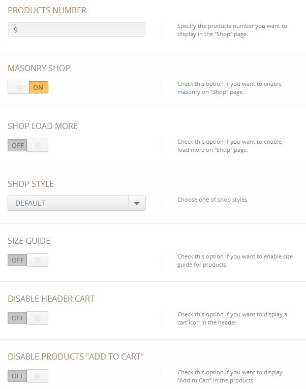
Additional Product Settings - top
Blaszok comes with many additional features for WooCommerce shop that need to be set up. If any of the features listed below are not shown in your website, please make sure that you enabled all of them in 'Screen Options' - you can find this in top right corner of product add/edit screen.
Size guidesGlobaly size guide can be set in 'Theme Options->Visuals->WooCommerce'. Each product can have his own Size Guide. To add individual size guide go to product edit screen and scroll down until Size Guide section. Please make sure that 'Enable custom "Size Guide"' is selected. Then click 'Add Image' button below and select image with size guide.
 Slide image on hover
If you want to add second image that will shown when someone hover product thumbnail please go to product edit screen and scroll down until Product Settings section. Please make sure that 'Disable Hover Slide' is not selected. Then click 'Add Image' button below and select Hover Image.
 Additional product tabs
If you want to add additional tabs that will shown near to 'Description' please go to product edit screen and scroll down until Custom Tabs section. First additional tab can be filled straight on. If you want more than one please click 'Add Tab' button below.
Each of the tab supports WYSIWYG editor and shortcodes.
Additional Product Category Settings - top
In Blaszok 1.3 we added several options for category pages that allow you to: set custom sidebar position for each of them separately, add custom header image, description or shortcode (for example Revolution Slider shortcode). Please read the description about new settings.
- Sidebar Position - allow to set an individual sidebar position for category.
- Header Content Type - allow to add an individual, fullwidth image or shortcode to the header of category page. Depending of the Header Content Type the additional field will shown - Image upload button or textarea with shortcode support.
Once again, thank you so much for purchasing this theme. As I said at the beginning, I'd be glad to help you if you have any questions relating this theme. No guarantees, but I'll do my best to assist. If you have any suggestions on how to improve our themes or documentation please share them!
MPC